- Color Analysis
- Color Analysis
- Facial Contrast
- Makeup Tips
Am I High or Low Contrast? A Simple Face Photo Test
Vella Beauty Editors••11 min read
If you’re asking “am I high or low contrast,” compare how light or dark your skin, hair and eyes look relative to one another: small differences suggest low contrast, strong differences suggest high contrast, and anything between suggests medium contrast. This guide walks you through a practical photo test, the lighting and hair-color issues that can confuse it, and ways to translate your result into lipstick, eyeliner and balanced makeup combinations.

See your colors on your face
Vella Studio finds your color season from a selfie and tries makeup looks on your own photo.
Am I high or low contrast? What you’re comparing
Facial contrast is the relative light–dark difference between your skin, hair and eyes. It isn’t a measure of beauty, how bright your eye color is, or how light your skin is on its own.
Think of those features as areas on a grayscale. If they sit close together in depth, they blend softly. If they sit far apart, they create stronger separation. Brows can reinforce that impression, but start with skin, hair and irises rather than letting one dark brow decide your result.
| Contrast level | What you see | Possible coloring pattern | Starting point for makeup |
|---|---|---|---|
| Low | Small light–dark differences; features blend together | Deep skin, dark hair and dark eyes with similar depths | Closely related depths and diffused edges |
| Medium | Clear differences without an extreme jump | Medium-depth skin, brown hair and eyes somewhat deeper than the skin | Moderate definition with one stronger accent |
| High | A pronounced light–dark jump between major features | Light skin with very dark hair and dark eyes | More pronounced definition or a clear focal point |
These are examples, not identity rules. Any skin depth can have low, medium or high contrast. Light hair and light skin don’t automatically mean low contrast if another feature creates a substantial depth difference.
Contrast isn’t undertone or color season
Undertone describes the warm, cool or neutral quality of your coloring. Contrast describes differences in depth. You can be warm and high contrast, cool and low contrast, or any other combination. If you need to separate those questions, use the Undertone Finder as a separate check.
A color season considers several dimensions, including temperature, depth and brightness or softness. Contrast can contribute useful information, but “high contrast equals Winter” is too simplistic. The guide to what color analysis is explains that wider framework.
For makeup, use contrast to choose how much light–dark separation to create, then undertone to help choose the shade family.
A high or low contrast face test you can do with a photo
You don’t need a numerical score to make this useful. You need a reliable photograph and a consistent way to compare the same features.
1. Take a neutral reference photo
Face a window with indirect daylight. Avoid direct sun, overhead spotlights and a bright window behind you. Your face should be evenly visible, without one cheek sitting in deep shadow.
Remove colored makeup if possible, especially foundation that changes your skin depth, dark brows, eyeliner and lipstick. Keep some hair visible around your face, and use a plain background that isn’t dramatically brighter or darker than you.
Turn off beauty filters and portrait effects where possible. Use the camera’s normal photo mode rather than a dramatic preset. If the image makes your skin look markedly lighter or darker than it does in the mirror, retake it.
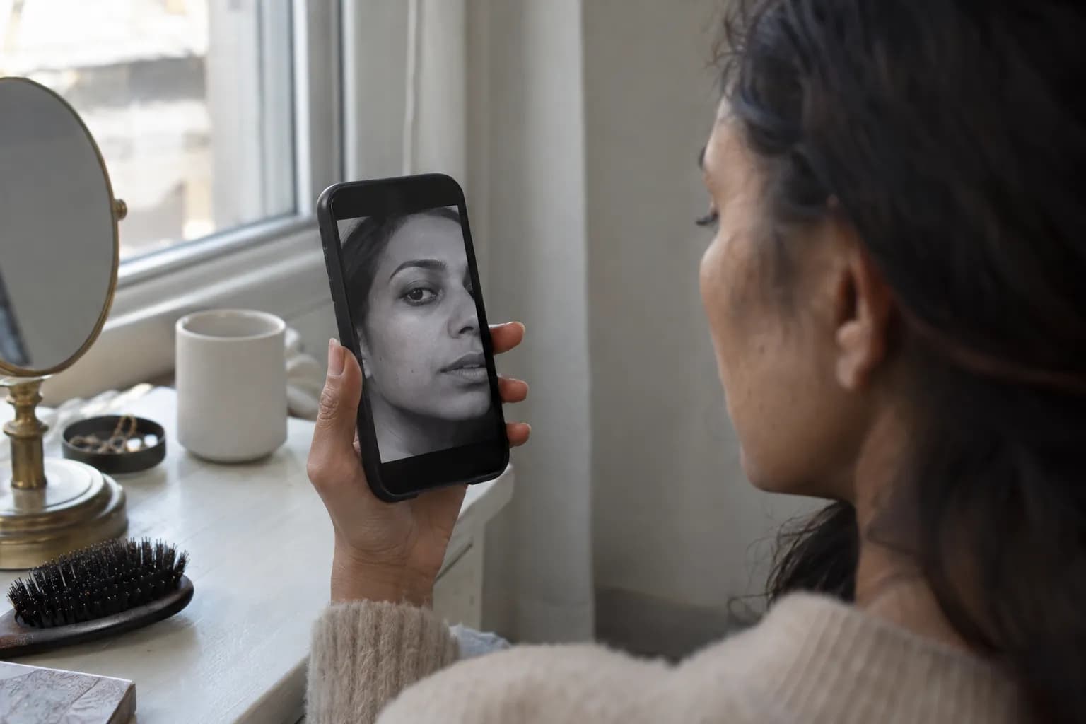
2. Make a grayscale copy
Keep the original, then create a basic black-and-white version. Avoid presets called dramatic, noir or high contrast: they deliberately alter the differences you’re trying to observe.
Grayscale helps separate color from depth. Copper hair and green eyes may look very different in color but surprisingly similar in grayscale. That’s color variation, not necessarily high light–dark contrast.
Treat grayscale as an aid, not a laboratory measurement. Different conversions can render colors differently, so check that the result still resembles the light–dark relationships in your original.
3. Compare three pairs
Look at the photograph at normal viewing size, then compare:
- Skin against hair: use an evenly lit cheek or forehead and a broad section of hair, not a shiny highlight.
- Skin against eyes: compare skin with the colored iris, not the pupil or whites of your eyes.
- Hair against eyes: notice whether their depths are close or clearly separated.
For each pair, ask whether the gap is small, moderate or large. Don’t judge individual pixels; shadows, reflections and phone processing make those misleading.
4. Choose the closest overall description
Low contrast: most areas are close in depth, with no major light–dark jump. Features remain visible, but the overall impression is blended.
Medium contrast: you see meaningful separation, but it isn’t extreme. You might have darker hair than skin while your eyes sit between them.
High contrast: a substantial part of your coloring creates a strong depth difference, often hair against skin. Not every pair needs to be far apart; dark hair and dark eyes can still create high contrast against much lighter skin.
If your observations are mixed, write down the pattern rather than forcing a label: “medium overall, stronger hair-to-skin contrast” is a useful result. Contrast exists on a continuum, and these three categories are practical guides rather than standardized diagnostic thresholds.
5. Repeat before deciding
Take another photo on a different day in similar indirect daylight. If your result changes dramatically, check exposure and shadows before assuming your coloring has changed.
Use the photos alongside your mirror impression. The most helpful result is one that stays reasonably consistent under ordinary, even lighting—not one produced by a single flattering selfie.
Common mistakes that change your contrast result
When a face contrast test feels inconsistent, the photograph or the comparison method is often the issue.
Mistaking lighting contrast for facial contrast
Direct sun can make skin highlights look much lighter while casting very dark shadows beneath brows and hair. That can exaggerate contrast. Flat, overexposed lighting can erase detail and make some features appear closer in depth—or make skin unnaturally pale against dark hair.
Diagnostic clue: if one side of your face seems high contrast and the other seems low, you’re probably reading the light. Retake the photo facing the window squarely.
Using filters or enhanced selfies
Beauty filters may brighten skin, deepen lashes, recolor irises or smooth away natural variation. Automatic camera processing can also affect the result, even when you haven’t chosen a filter.
Diagnostic clue: compare your hairline, cheek and eyes with your reflection in the same light. If the photograph changes those relationships noticeably, don’t use it as your reference.
Treating dyed hair as irrelevant—or as your natural coloring
Dyed hair can genuinely change the contrast you see around your face. Taking naturally light hair much darker may increase hair-to-skin separation; lightening dark hair may reduce it, depending on skin depth.
For makeup you’ll wear now, assess your current hair because it frames your face. For understanding your natural coloring, use visible roots or a reliable older photograph. Neither question is wrong; they’re simply different.
Highlights complicate things too. Judge the broad mass of hair near your face, not the lightest strand. Gray or white hair can also change your current contrast without changing your undertone.
Confusing striking color with high contrast
Vivid blue eyes or bright copper hair can attract attention without creating a large light–dark gap. Return to the grayscale copy and compare depth rather than how unusual or saturated the color looks.
Also resist judging by eye whites or tiny catchlights: they can create sharp local contrast that doesn’t describe your overall coloring. Likewise, a strong brow is useful context, not a substitute for comparing skin, hair and eyes.
Low-contrast makeup: keep depth changes connected
If your coloring is low contrast, closely related makeup depths are a useful starting point for an integrated look. That does not mean everything must be pale, beige or barely visible. On deep skin, a harmonious palette may include rich cocoa, muted plum and deep rosewood.
Choose lipstick relative to your natural lip depth
Start with a lipstick near your own lip depth or a little deeper. Consider dusty rose, peach-brown, muted mauve, rosewood or soft cocoa, choosing warm or cool versions according to your undertone.
Apply a thin layer, press your lips together, then soften the border with a clean fingertip. Satin, balm-like or softly blotted finishes make the transition less abrupt. A matte lipstick can also work; the important variables are depth and edge definition, not finish alone.
If you want brick red or berry, try it as a stain first. The blurred lip technique is a practical way to keep a rich shade without creating a sharply outlined block.
Keep eyeliner close to the lashes
Try warm taupe, muted brown, gray-brown or soft charcoal, depending on your coloring. Deep brown may create a gentle effect on deep skin even though it looks dark in the pencil.
Press liner into small gaps along the upper lash line, then smudge the outer third with a small brush. Keep the line narrow before deciding whether you want more definition. Black is still an option; a fine, softened line creates less visual weight than a thick opaque wing.
Build a connected combination
Try warm taupe shadow, softly smudged brown liner, muted peach-brown blush and a rose-brown lip. For cooler coloring, use mushroom taupe, gray-brown liner, dusty rose blush and muted mauve lipstick.
Keep blush diffused across the cheeks with no obvious starting edge. If you choose a statement lip, leave the eyes softer so the contrast feels intentional rather than accidental.
Medium-contrast makeup: add one clear accent
Medium contrast gives you room for both soft transitions and noticeable definition. A useful everyday formula is moderate depth throughout, plus one slightly stronger feature.
Set a middle-depth lip baseline
Try rosewood, medium berry, terracotta, caramel rose or muted brick red. Compare each against your natural lip depth: the same lipstick can be subtle on one face and a strong focal point on another.
Apply one even layer and assess it from arm’s length. If the lip dominates more than you want, blot once. If your features seem less defined than you prefer, add a second layer or a slightly deeper liner, blended inward so it doesn’t form a separate ring.
Use liner to control emphasis
Chocolate, charcoal, deep plum and black-brown are useful starting points. Draw a thin line across the upper lashes, keeping the inner section fine and gradually adding thickness toward the outer corner.
For a softer look, diffuse the outer edge. For a more defined look, keep a small wing crisp while leaving the lid shadow softly blended. You can change the overall intensity without changing the liner color.
Balance your combinations
Pair bronze or taupe shadow with chocolate liner, softly applied rose blush and medium rosewood lipstick. For a lip-led look, use muted brick lipstick with a light wash of shadow and a narrow lash line.
If you deepen both eyes and lips, keep cheek color blended and avoid adding a very pale, sharply contrasting under-eye area. The goal is a deliberate distribution of depth, not identical intensity everywhere.
High-contrast makeup: use definition without adding weight everywhere
High-contrast coloring often works well with pronounced definition because strong light–dark differences already exist in your face. But you don’t need a full smoky eye and dark lipstick to look balanced.
Give lipstick enough distinction for your goal
For a defined look, explore clear red, brick red, cranberry, deep berry, wine or rich plum. Undertone still matters: contrast alone cannot tell you whether orange-red or blue-red is the better direction.
Apply lipstick evenly, then refine the outer edge with a matching liner if you want precision. For a softer day, press the same shade on as a stain instead of switching automatically to a pale nude.
Nude lipstick is absolutely an option. Start near your natural lip depth in rosy brown, caramel brown or cocoa rather than assuming nude means light beige. Pair it with defined lashes or liner if you want to preserve stronger facial definition.
Adjust eyeliner intensity through width
Black, espresso, deep charcoal and deep aubergine can provide clear definition. Start with a narrow upper-lash line and build outward; opaque color doesn’t require a thick shape.
If you want a bold wing, check it with your eyes open so its shape remains visible. Keep lower-lash definition lighter or limited to the outer portion unless an intentionally smoky effect is your goal.
Choose where the strongest contrast sits
Try a thin black wing, softly blended neutral shadow, rose blush and cranberry lipstick. Alternatively, pair espresso smoky eyes with a natural-depth rose-brown lip.
A soft, minimal look can work too. Use sheer cheek color, a tinted lip and a little lash definition. Matching your natural contrast is an option for harmony, not a rule that prevents you from choosing a gentler effect.
Check your contrast with Vella, then compare makeup
For a guided second check, use the free Contrast Analyzer. Start with the evenly lit, unfiltered reference photo from your test, and treat the result as guidance rather than a fixed verdict.
To explore the makeup side, Vella Studio offers photorealistic makeup try-on on your own photo, with a before/after slider and named shades. Compare a softer lip-and-liner combination with a more defined one, paying attention to whether the makeup supports the effect you want.
The iPhone and Android app also offers 12-season color analysis from a selfie. It’s free to download, with unlimited use unlocked through Vella Pro; photos aren’t sold or used to train AI.
Keep your first experiment simple: change lipstick depth or eyeliner intensity, not everything at once. Your contrast level gives you a useful starting point, while your preferred makeup effect decides where you go next.
Frequently asked questions
How do I know if I’m high or low contrast?
Compare the light–dark depths of your skin, hair and irises in an evenly lit, unfiltered photograph. Similar depths suggest low contrast, a strong gap suggests high contrast, and moderate differences suggest medium contrast. A basic grayscale copy can help you separate depth from color.
Can you have dark skin and low contrast?
Yes. Low contrast means your features are relatively close in depth, not that they are light. Deep skin, dark hair and dark eyes can create low contrast when their light–dark differences are small.
Does dyed hair change your facial contrast level?
Dyed hair can change the visible contrast between your hair and skin. Assess your current hair for everyday makeup decisions, but use roots or a reliable older photo when exploring your natural coloring. Changing hair color does not change your undertone.
Does high contrast mean you’re a Winter color season?
No. High contrast can be one clue in seasonal color analysis, but it cannot identify a season by itself. Temperature, overall depth and brightness or softness also matter.
What does medium contrast look like?
Medium contrast means your skin, hair and eyes have noticeable but not extreme light–dark differences. For example, your hair may be clearly darker than your skin while your eye depth falls somewhere between them. Mixed patterns are normal, so you do not need every feature pair to show the same gap.
Can low-contrast faces wear black eyeliner and red lipstick?
Yes—contrast guidance is about the effect you create, not which makeup you are allowed to wear. For a softer result, keep black liner thin and smudged or apply red lipstick as a stain. For a deliberate statement, use crisp edges and stronger opacity.
Try it on your own face
Vella Studio finds your color season and shows every look on your photo — every shade named, so you know exactly what to buy.