- Color Analysis
- Color Analysis
- Seasonal Color
- Makeup Tips
- Personal Style
What Is Color Analysis? A Guide to the 12 Seasons
Vella Beauty Editors••11 min read
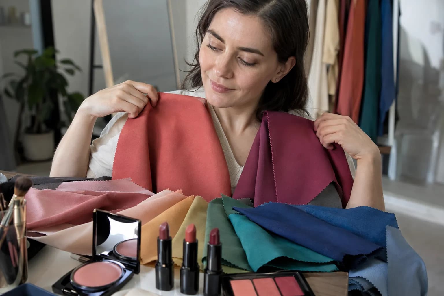
Color analysis is a styling method that helps you choose clothing and makeup shades that harmonize with your natural coloring. If you’re asking what is color analysis, the useful answer goes beyond finding a season: it gives you a framework for comparing warmth, depth, and brightness. This guide explains the 12-season system, practical shade choices, and how at-home, professional, and AI analysis differ.

See your colors on your face
Vella Studio finds your color season from a selfie and tries makeup looks on your own photo.
What is color analysis actually measuring?
Seasonal color analysis considers how colors interact with the appearance of your skin, eyes, and hair. Rather than assigning a palette from eye color alone, a useful analysis compares what happens when different shades sit beside your face.
It’s a styling framework, not a medical test or a universally standardized measurement. Your result should help you make choices, not create rules you have to obey.
Undertone: warm, cool, or somewhere between
Undertone describes the underlying warm-to-cool direction of your coloring. In palette terms, warmer colors tend toward yellow or golden influences; cooler colors tend toward blue influences. Think tomato red versus blue-red, or peach versus cool pink.
Your skin’s depth is separate from its undertone. Fair, medium, and deep skin can each have warm, cool, or neutral undertones. Olive coloring can also lean warm, cool, or neutral; it isn’t an automatic Autumn assignment.
If this distinction feels unclear, the Undertone Finder offers a starting point. Treat its result as a clue to compare against real colors.
Value: light versus deep
Value means how light or dark a color is. Powder blue has a lighter value than navy; pale peach is lighter than rust.
A palette’s value is not simply your skin shade. The relationship between your features matters, and your best depth is worth testing rather than inferring from one feature.
Chroma: muted versus bright
Chroma describes color intensity. Dusty rose and muted sage have lower chroma; clear fuchsia and vivid emerald have higher chroma. A muted color isn’t necessarily light, and a bright color isn’t necessarily warm.
Contrast is related but different: it describes the difference between colors or features. The Contrast Analyzer can help you explore those differences, but contrast alone doesn’t determine your season.
The 12-season system, explained simply
The four main seasonal families combine temperature and intensity: Spring is generally warm and clear, Summer cool and muted, Autumn warm and muted, and Winter cool and clear. The 12-season system divides each family into three palettes with a more specific emphasis.
“True” usually describes the most distinctly warm or cool version of a family. Some systems use “Warm Spring” or “Cool Summer” instead; naming and palette boundaries vary.
| Season | Main emphasis | Typical shade families |
|---|---|---|
| Light Spring | Light, warm-leaning, relatively clear | Peach, light coral, warm ivory, fresh aqua |
| True Spring | Warm and clear | Apricot, tomato red, golden yellow, leaf green |
| Bright Spring | Bright with a warm lean | Vivid coral, clear turquoise, warm pink, lime |
| Light Summer | Light, cool-leaning, gently muted | Powder blue, cool pale pink, lavender, light gray |
| True Summer | Cool and softened | Dusty rose, soft navy, blue-gray, cool berry |
| Soft Summer | Muted with a cool lean | Mauve, slate blue, cool taupe, muted plum |
| Soft Autumn | Muted with a warm lean | Warm taupe, sage, dusty peach, muted terracotta |
| True Autumn | Warm and earthy | Rust, mustard, olive, cinnamon, brick red |
| Deep Autumn | Deep with a warm lean | Espresso, aubergine, dark olive, warm burgundy |
| Deep Winter | Deep with a cool lean | Inky navy, black cherry, pine, charcoal |
| True Winter | Cool and clear | Blue-red, cobalt, fuchsia, black, crisp white |
| Bright Winter | Bright with a cool lean | Electric blue, vivid raspberry, emerald, icy pink |
These are starting families, not precise swatch specifications. Two items labeled “sage” can differ significantly in warmth and saturation.
Neighboring seasons share qualities. Soft Summer and Soft Autumn are both muted, while Deep Autumn and Deep Winter both emphasize depth. If two palettes work, compare their main difference: cool taupe against warm taupe, for example, rather than two unrelated colors. If deeper shades suit you, the Deep Winter vs Deep Autumn guide helps you distinguish their cool and warm leanings with paired drapes.
You also don’t need to resemble a stereotypical seasonal portrait. Hair and eye color offer clues, but the colors beside your face provide more useful evidence than a checklist of features.
Why your palette matters for clothes
Color analysis can make shopping more deliberate. Instead of wondering whether you “can wear green,” you can compare warm olive, muted sage, clear emerald, and icy mint.
Start with colors closest to your face: tops, jackets, scarves, and collars. These make better testing grounds than shoes or trousers because you can see their relationship to your complexion immediately.
Build a small working palette around:
- Two neutrals: perhaps warm ivory and chocolate, or cool gray and soft navy.
- Two everyday colors: such as terracotta and olive, or dusty rose and slate blue.
- One accent: brick red, clear coral, cool berry, or cobalt, depending on your comparisons.
Then consider the contrast between pieces. A soft navy top with blue-gray trousers creates a gentler combination than black and crisp white. Neither is inherently better; they create different effects.
For a concrete muted, cool-leaning example, the Soft Summer color palette can help you visualize a coordinated group rather than isolated swatches.
Keep clothes you love even if they fall outside your palette. You can place an unfamiliar shade below the waist, add a preferred scarf near your face, or deliberately use contrast for impact. Harmony is one styling goal, not the only one.
How to translate your season into makeup
Makeup needs more nuance than clothing because pigment sits directly on your skin. Your natural lip color, the product’s opacity, and its finish can all change how a shade appears.
Keep foundation separate from seasonal palettes
Match foundation to your actual skin depth and undertone, checking the blend between your face and neck in indirect daylight. Don’t choose a pink foundation just because you’ve been typed as Summer, or a golden one solely because you’re Autumn. If you’re unsure where to start, our guide to finding your undertone explains how to compare swatches and weigh supporting clues.
A season is most useful for choosing color cosmetics, not replacing complexion matching.
Choose blush and lipstick by temperature and intensity
Use these combinations as starting points:
- Spring: peach or clear coral blush with apricot, warm pink, or tomato-red lips.
- Summer: cool pink or dusty rose blush with rose, mauve, or softened berry lips.
- Autumn: muted peach or terracotta blush with cinnamon, brick red, or warm rose lips.
- Winter: cool rose or berry blush with blue-red, raspberry, or plum lips.
Apply a small amount of blush to the upper cheek, then diffuse it outward toward the temple. Keep placement and application strength consistent when comparing two shades, so you’re judging color rather than technique.
For lipstick, compare the full face rather than your mouth alone. Does the color feel connected to your features, or does it become the only thing you notice? A statement lip can intentionally do the latter.
Depth still matters within each family. On deeper skin, a pale, opaque peach may look chalky where a richer coral creates the intended effect. Adjust pigment depth and payoff rather than abandoning the entire color family.
Adjust eyeshadow, liner, and finish
Try warm taupe, bronze, or olive for a warm-leaning palette; cool taupe, slate, or muted plum for a cool-leaning one. Sweep the midtone over the mobile lid and blend the edge just above the crease. Place a deeper coordinating shade along the upper lash line for definition. If your crease hides your liner, our guide to eyeliner for hooded eyes shows you how to map a wing that stays visible.
Soft palettes can start with diffused pencil and satin textures. Clearer palettes can experiment with sharper liner or a more defined lip. These are adjustable effects, not restrictions: a sheer raspberry gloss is much softer visually than an opaque raspberry liquid lip. If your coloring is muted and warm-leaning, the Soft Autumn palette and makeup guide offers specific shade combinations.
How to try color analysis at home
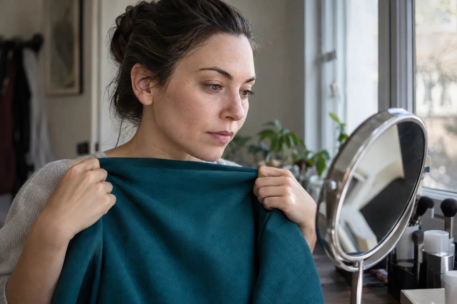
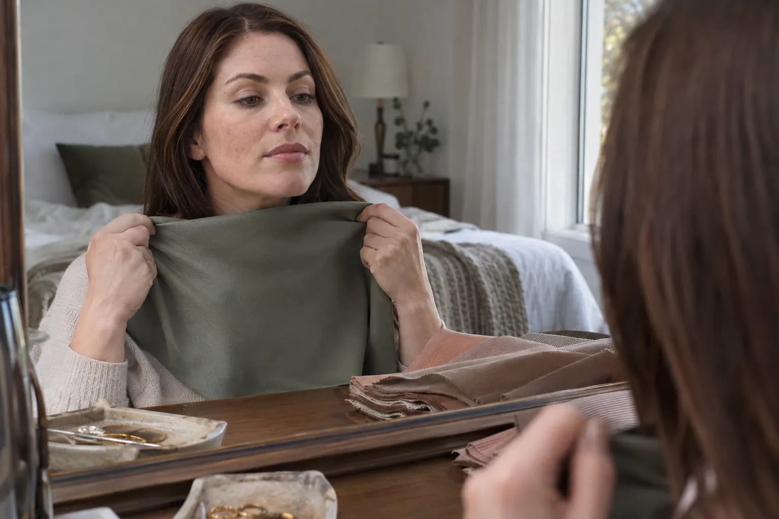
At-home draping means holding colors beneath your face and observing the differences. You don’t need professional fabric sets, but you do need a reasonably controlled setup.
- Find even, indirect daylight. Face a window without direct sun striking one side of your face. Switch off strongly warm or cool indoor lights.
- Remove color distractions. Start without color cosmetics. Cover your top with a neutral cloth and pull hair away from your face, especially if it’s dyed.
- Choose comparable fabrics. Use similarly sized, matte pieces. Shiny satin versus fuzzy knit introduces a texture difference that can distract from color.
- Test temperature first. Compare warm ivory with cool white, or peach with cool pink. Use several pairs because one comparison can mix temperature with brightness or depth.
- Test value next. Compare lighter and deeper shades within a similar color family, such as pale blue-gray and deeper slate blue.
- Test chroma. Compare muted rose with clearer pink, keeping their temperature and depth as close as possible.
- Record repeated patterns. Write down “muted colors feel more balanced” or “deeper shades give useful definition” before trying to name a season.
Look for your face remaining easy to see, your features appearing defined, and the overall color relationship feeling cohesive. Notice whether a fabric seems to emphasize uneven-looking areas or makes your face appear visually separate from the outfit.
Those judgments are subjective, so don’t decide from one dramatic reaction. Repeat promising comparisons on another day under similar light. If you photograph them, keep camera position, exposure, and white balance consistent where possible; automatic adjustments can disguise the differences.
At-home vs. professional vs. AI color analysis
The best method depends on whether you want an inexpensive starting point, guided interpretation, or a convenient digital comparison.
| Method | Most useful for | Main limitation | How to get more value |
|---|---|---|---|
| At-home draping | Learning your own color preferences and reactions | Lighting, fabric selection, and expectation can influence judgment | Compare one quality at a time and repeat tests |
| In-person professional analysis | Guided fabric comparisons and explanations | Methods and analyst interpretations vary | Ask about their system, lighting, and how they explain borderline results |
| AI photo analysis | A quick starting palette from a photo | Camera processing, makeup, and lighting affect the input | Use an unfiltered image in even daylight and verify with real fabrics |
An in-person analyst can compare physical drapes without relying solely on a photograph. That is useful, but a professional label is still an interpretation within a styling system, not an infallible verdict.
Before booking, ask whether the session includes temperature, value, and chroma comparisons, and whether you’ll receive usable shade guidance. Remote professional services share some of the same photo limitations as AI tools.
AI is convenient for forming a hypothesis. It cannot guarantee that a displayed lipstick will look identical in person, because screen settings, product texture, and your natural pigmentation affect the result. Use any result to narrow your options, then test the colors you’ll actually wear.
Common mistakes—and how to tell what’s going wrong
Using veins or jewelry as a final answer
Vein color is difficult to judge reliably, and jewelry preferences can reflect finish, design, or habit. If gold seems better than silver, compare warm and cool fabrics too. Look for agreement across several tests rather than treating one clue as proof.
Confusing surface color with undertone
Visible pinkness doesn’t automatically mean cool undertones, and a tan doesn’t automatically mean warmth. If your initial label conflicts with repeated draping results, reassess it. For skin conditions or persistent skin concerns, ask a dermatologist rather than using color analysis as an explanation.
Changing too many variables at once
If stark white feels harsh but ivory looks comfortable, you may be responding to softness rather than warmth. Compare a softer cool white next. Likewise, if orange loses to navy, that doesn’t isolate undertone: the colors also differ in depth and intensity.
Assuming one unsuccessful shade rules out a season
A dusty rose lipstick might look gray because it’s too pale or opaque, not because all muted colors are wrong for you. Try a deeper rose or a sheer version before changing your whole palette.
If muted colors consistently look dull while clearer versions feel balanced, brightness may deserve more weight. If vivid shades repeatedly dominate your face, test softer equivalents.
Expecting every method to give the same label
Different photos, systems, and interpretations can produce neighboring results. When that happens, identify the shared qualities. If both results favor deep colors, start with depth and compare temperature separately.
A practical palette you enjoy is more valuable than endlessly chasing a perfectly certain seasonal name.
Explore your palette with Vella
For a starting point, try the Free AI Color Analysis browser tool, then compare its suggestions with a few real fabrics in daylight.
The Vella Studio app offers 12-season color analysis from a selfie, with a personal palette for makeup, clothes, and accessories. Its photorealistic makeup try-on lets you view shades on your own photo and compare them using a before/after slider; every shade is named so you can look for it when shopping.
The app is available for iPhone and Android and is free to download; Vella Pro unlocks unlimited use. Use the preview to shortlist colors, then check real-world shades and finishes before committing.
Frequently asked questions
How do I find out what my color season is?
Compare warm versus cool, light versus deep, and muted versus bright fabrics near your face in even, indirect daylight. Look for patterns across several comparisons rather than relying on your hair color or one jewelry test. At-home draping, professional analysis, and AI tools can all help you develop a working palette.
Is color analysis scientifically proven?
Seasonal color analysis is a styling framework, not a universally standardized scientific test. Its judgments involve visual perception and aesthetic preferences, and different methods can assign different labels. It is most useful as a practical way to compare colors rather than an objective verdict about what you can wear.
Can you have a neutral undertone and still have a color season?
Yes. Several palettes in the 12-season system lean warm or cool without being as strongly temperature-led as the True seasons. If your undertone is relatively neutral, depth or brightness may be a more useful starting point for comparisons.
Does your color season change when you dye your hair?
Dyeing your hair changes the visible color and contrast around your face, but it doesn’t change your skin’s undertone. You may prefer different outfit or makeup combinations afterward. Cover dyed hair during draping if you want to assess your coloring without its influence.
Is AI color analysis as accurate as a professional?
There isn’t a universal accuracy ranking because results depend on the tool, photo quality, analyst, and system used. AI relies on a processed image, while an in-person professional can compare physical drapes under controlled conditions. Either result is more useful when it comes with shade guidance you can verify in everyday lighting.
Try it on your own face
Vella Studio finds your color season and shows every look on your photo — every shade named, so you know exactly what to buy.