- Color Analysis
- Color Analysis
- Deep Winter
- Deep Autumn
- Makeup Shades
Deep Winter vs Deep Autumn: Colors, Tests and Makeup
Vella Beauty Editors••11 min read
The key difference in deep winter vs deep autumn is temperature: both suit depth, but Deep Winter favors cool-neutral, clearer colors, while Deep Autumn favors warm-neutral, slightly softened richness. You cannot reliably separate them by dark hair or brown eyes alone. This guide compares their palettes, walks you through controlled drape tests, and translates your result into wearable makeup.

See your colors on your face
Vella Studio finds your color season from a selfie and tries makeup looks on your own photo.
Deep Winter vs Deep Autumn: the side-by-side comparison
In the common 12-season system, these neighboring seasons are also called Dark Winter and Dark Autumn. Their shared dominant quality is depth: substantial, darker colors generally work better than a wardrobe built entirely around pale shades.
Their differences involve three separate color qualities:
- Undertone: whether your most harmonious colors lean cool or warm.
- Value: how light or dark a color is.
- Chroma: how clear and saturated, or softened and muted, a color appears.
Dark does not automatically mean muted. A deep emerald can be both dark and saturated; a dark olive can be equally deep but more softened.
| Quality | Deep Winter | Deep Autumn |
|---|---|---|
| Temperature direction | Cool-neutral | Warm-neutral |
| Dominant quality | Depth | Depth |
| Chroma | Generally medium-high; clear and saturated | Generally medium; rich with some softening |
| Useful dark neutrals | Black, ink navy, charcoal, cool espresso | Dark chocolate, warm espresso, deep olive, brown-black |
| Reds and berries | Blue-red, black cherry, cool burgundy, blackberry | Brick red, warm oxblood, burnt tomato, brown-red |
| Greens and blues | Deep emerald, pine, sapphire, blue-leaning teal | Forest green, olive, petrol, green-leaning teal |
| Light accents | Optic white and icy pink or blue, used selectively | Cream, ecru, warm beige, muted gold |
| Typical styling effect | Crisp, deep, and defined | Rich, deep, and earthy |
These are tendencies, not rules for what you are allowed to wear. Seasonal analysis is a styling framework, and palette boundaries vary between systems. Your repeated response to colors matters more than matching a rigid description.
Also, seasonal temperature is not a foundation label. You can have a surface golden cast or olive coloring and still prefer cool-neutral clothing colors; foundation must match your actual skin rather than your season's name.
The best colors for each season—and where they overlap
Deep Winter: depth with clean definition
Build around ink navy, charcoal, black, and cool espresso. Add black cherry, deep raspberry, aubergine, sapphire, and emerald rather than defaulting to every bright color labeled “Winter.” Depth should still anchor the outfit.
For a simple combination, try a charcoal top with a blackberry lip, or an ink-blue neckline with a small icy-pink accessory. An optic-white collar against a dark jacket can introduce clarity without making pale colors the whole look.
If camel, mustard, or orange-heavy rust seems disconnected from your face, replace it with cool taupe, deep pine, or burgundy. Compare the specific shade, though: a dark neutral camel may behave differently from a bright golden one.
The Deep Winter color palette gives you a focused starting point for exploring this cooler, deeper range.
Deep Autumn: depth with earthy richness
Start with chocolate, warm espresso, deep olive, and brown-black. Add aubergine with a reddish-brown cast, dark petrol, forest green, brick, and warm oxblood. Your palette is not limited to orange and brown.
Try a chocolate neckline with a brick-red lip, or deep olive with a muted-gold earring. Cream can provide a lighter accent without the starkness of optic white.
Be careful not to confuse “slightly softened” with dusty or faded. Pale dusty rose, washed-out sage, and light oatmeal may lack the depth that makes this season distinctive. Rich dark teal can be more useful than a very muted beige.
Use the Deep Autumn color palette to explore those darker warm-neutral combinations.
Shared colors are useful, not a problem
Both seasons can often borrow deep teal, aubergine, dark burgundy, and near-black browns. The exact dye, fabric, and colors worn beside them influence how they read.
If a dark teal looks excellent but tells you nothing about your season, keep wearing it. Use more clearly warm-versus-cool pairs for diagnosis rather than forcing a shared shade to choose a side.
At-home drape tests that help tell them apart
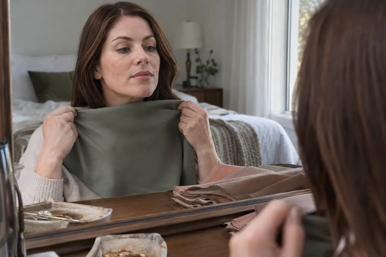
A useful drape test changes one quality at a time. Comparing pale peach with black changes temperature, depth, and contrast simultaneously, so it cannot tell you which difference mattered.
Step 1: make the setup consistent
- Face a window in indirect daylight. Avoid direct sun, colored light bulbs, and strongly colored curtains reflecting onto your face.
- Remove colored makeup and tinted lip products. Cover a brightly colored shirt with a neutral towel.
- Pull hair away from your face. If it is dyed, cover it with a neutral fabric so its color does not dominate the comparison.
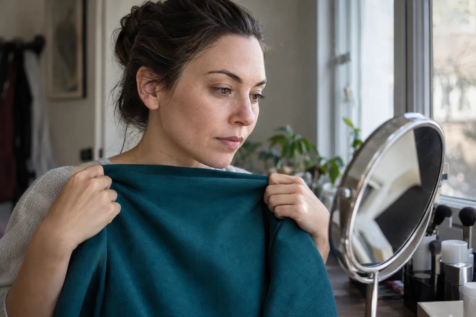
- Hold each drape directly below your chin, covering roughly the same area of your chest.
- Compare in a mirror first. If you take photos, keep the position and lighting fixed, turn off filters, and lock exposure and white balance if possible.
Use opaque fabrics with similar finishes. A shiny satin scarf and a matte T-shirt reflect light differently, even when their colors seem comparable.
Step 2: compare matched dark colors
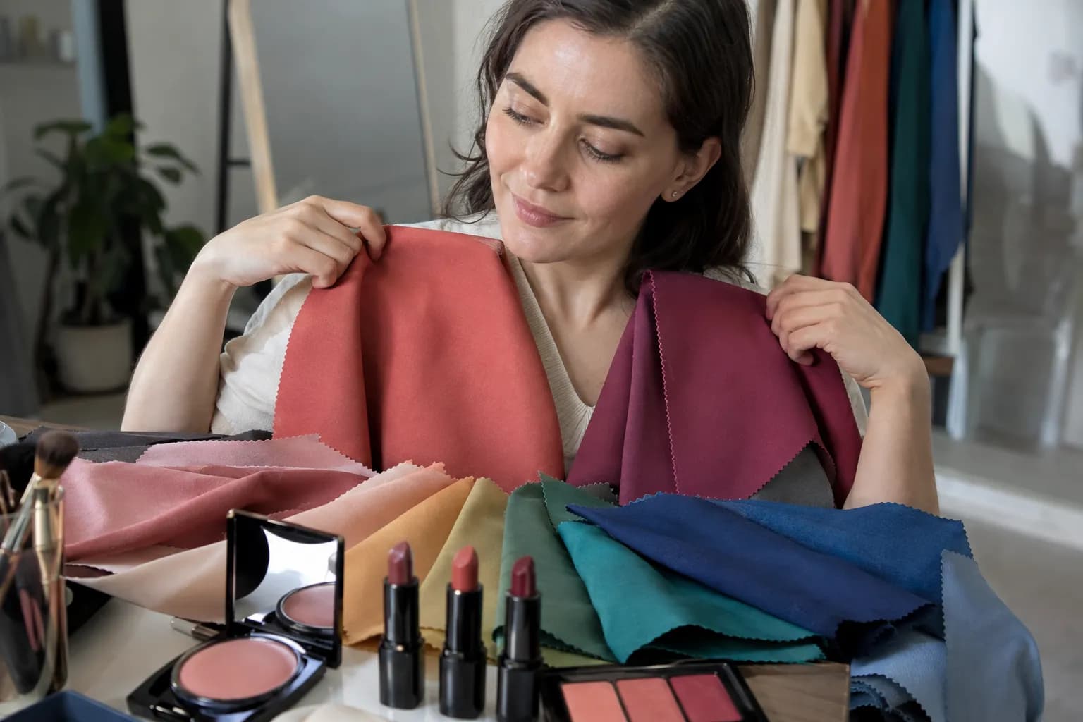
Start with what you own. Aim for similar darkness and saturation within each pair; shade names alone do not guarantee a fair match.
| Cooler candidate | Warmer candidate | What the pair can help assess |
|---|---|---|
| Cool burgundy with a berry cast | Warm oxblood with a brown-red cast | Whether your best deep reds lean berry or earthy |
| Blue-leaning deep teal | Green-leaning deep teal | Temperature preference within a shared color family |
| Cool espresso | Warm chocolate of similar depth | Whether cool or warm dark neutrals feel more integrated |
| Deep plum | Deep reddish-brown aubergine | Preference for violet-based versus warmer purples |
| Black | Very dark brown | Whether crisp black or a warmer near-black is easier to wear |
The black-versus-brown pair is a supporting test, not a verdict. Some Deep Autumn palettes include workable near-blacks, and some people prefer black simply because they wear it often.
Step 3: look at your face, not the fabric
Switch between the two fabrics several times. Ask:
- Does one make the area around your mouth or eyes appear more shadowed?
- Does your face seem visually separate from the color, or do they read together?
- Are your lips and eyes still noticeable without makeup?
- Does one fabric introduce a distracting yellow, orange, gray, or pink reflection?
Some reflected color is inevitable. You are looking for a repeated difference in the overall impression, not treating every temporary cast as proof of an undertone.
Write a short observation for each pair before naming a winner. “Eyes clearer; mouth less shadowed” is more useful than “I like green.”
Step 4: repeat before deciding
Repeat the comparisons on another day in similar daylight. A consistent preference for cooler deep shades supports Deep Winter; a consistent preference for warmer deep shades supports Deep Autumn.
A mixed result may mean your best colors sit close to the boundary—or simply that the fabrics were not well matched. Do not turn one flattering scarf into a definitive diagnosis.
Common mistakes that blur the distinction
Assuming dark features automatically mean a deep season
Dark hair and eyes are clues, not a complete analysis. Both seasons can occur across skin depths and ethnicities, and hair can become lighter, grayer, or artificially warmer without changing which clothing colors flatter your face. To assess the light–dark differences between your features, use this high-or-low contrast photo test; contrast alone cannot identify your season.
If nearly every dark drape overwhelms you, revisit the assumption that depth is your dominant quality. Another seasonal family may be a better starting point.
Treating olive skin as automatically warm
Olive coloring can appear warmer, cooler, or relatively neutral. A greenish surface cast does not settle the Winter-versus-Autumn question, and visible redness does not automatically mean a cool undertone.
If you need to separate surface color from undertone clues, the guide to how to find your undertone provides useful context. For seasonal decisions, keep returning to controlled face-level comparisons.
Using jewelry as the deciding test
Gold versus silver changes more than temperature: polish, size, brightness, and placement all affect the result. A small brushed-gold hoop is not equivalent to a large mirror-bright silver necklace.
Use jewelry as a supporting clue. Fabric covers a larger area near your face and makes subtle differences easier to compare consistently.
Comparing “bright” with “dull” instead of cool with warm
A vivid blue-red lipstick versus a faded beige lipstick is not a fair temperature test. You may prefer the red because of its depth, saturation, or stronger definition.
Likewise, do not compare a glossy berry lip with a chalky matte terracotta. Match the finish and approximate depth before judging their temperature.
Expecting every palette color to look equally good
Your best lip color may be more neutral than your best blouse. Lip pigmentation, sheerness, and the amount of color applied can shift how makeup appears.
If the tests remain inconsistent, build a small shared palette of dark teal, balanced burgundy, and espresso. You can make good choices without forcing a seasonal label.
Deep Winter makeup: cool depth without heaviness
The goal is definition, not a full face of black and jewel tones. Choose one focal point and let the other features stay quieter.
Eyes: charcoal, cool taupe, and plum-brown
Sweep a matte cool taupe across the lid and just above the crease. On hooded eyes, check the placement with your eyes open so a little shading remains visible above the fold.
Press charcoal or cool espresso shadow along the upper lash roots, concentrating the deepest color on the outer third. Add black or deep brown-black mascara. For evening, blend a touch of deep plum into the outer corner rather than surrounding the whole eye with dark shadow.
A restrained pewter or cool-champagne shimmer at the inner corner can add light. Frosty silver is optional, not a seasonal requirement.
Cheeks: rose, berry, or plum-rose
Apply a sheer cool rose or berry blush to the upper cheek, then blend toward the temple. Begin with a small amount and build: the same berry can look softly rosy in a thin layer and dramatic when applied densely.
On deeper skin, a more pigmented berry or plum-rose may register better than a pale pink. Avoid choosing a chalky blush simply because it is cool-toned.
Lips: blue-red, black cherry, and rose-brown
For everyday makeup, try a neutral-cool rose-brown or muted berry that has enough depth to define your lips. Trace the natural lip edge with a similar pencil, then press lipstick into the center and blend outward.
For more impact, use blue-red, cool burgundy, or black cherry in a satin finish. A sheer berry balm is an easier option if an opaque dark lip dominates your face.
A practical five-minute combination: cool-taupe shadow, charcoal lash-line definition, black mascara, sheer rose blush, and a berry-stained lip. Keep foundation matched to your skin; do not deliberately make it pinker to fit the palette.
Deep Autumn makeup: warm richness with definition
Think bronze, olive, brown-red, and warm rose rather than applying orange everywhere. Warm-neutral shades often give you the most flexible starting point.
Eyes: warm taupe, bronze, and olive-brown
Blend a matte warm taupe over the lid, then add chocolate to the outer third and crease. Press a small amount of bronze shimmer onto the mobile lid, keeping the crease matte if you want clearer definition.
For a less predictable alternative, use olive-brown along the upper lash line and soften it with a small brush. Dark espresso liner can deliver depth without the sharper effect of jet black, although black mascara may still work well.
Choose antique gold rather than very pale yellow-gold if the lighter shade looks disconnected from the rest of your makeup.
Cheeks: terracotta-rose, cinnamon, and burnt peach
Place blush on the upper apples of the cheeks and blend outward, keeping the edges sheer. Terracotta-rose and cinnamon can echo the warmth of a brick lip without creating an entirely orange face.
Adjust depth to your complexion. A deeper burnt peach may be more effective than pale apricot, while a strong cinnamon blush may need a very light hand on lighter skin.
Bronzer is optional. If you use it, keep the shade softly brown rather than automatically choosing the most golden or orange option.
Lips: brick, warm oxblood, and chestnut-rose
For everyday wear, try chestnut-rose, caramel-brown with enough depth, or a warm rosewood. For a stronger lip, choose brick red, brown-red, or warm oxblood.
Outline with a coordinating brown-red pencil, fill the lips lightly, then add a satin lipstick. Blot once if you want a softer edge while retaining depth.
A practical five-minute combination: warm-taupe shadow, espresso liner, brown-black mascara, terracotta-rose blush, and a sheer brick lip. Avoid a pale beige “nude” that removes the definition your deeper palette benefits from.
Use Vella as a starting point, then check in daylight
If you want an initial direction, try the Free AI Color Analysis. Treat the result as a hypothesis to compare with your drape notes, especially if your photo was taken under warm indoor lighting.
The Vella Studio app offers 12-season color analysis from a selfie and photorealistic makeup try-on on your own photo, with named shades and a before/after slider. Use it to explore a cool berry lip versus a warmer brick direction while keeping the rest of the look similar.
The app is available for iPhone and Android and is free to download; Vella Pro unlocks unlimited use. A photo-based result cannot remove lighting and camera uncertainty, so your most useful next step is still simple: compare several well-matched drapes, then try one wearable makeup combination from the palette that consistently works better.
Frequently asked questions
Can you be between Deep Winter and Deep Autumn?
Your best colors can sit close to the boundary between these neighboring palettes. Both emphasize depth, so dark teal, aubergine, and balanced burgundy may work even when your warm-versus-cool preference is subtle. Use repeated drape comparisons rather than forcing a decision from one color.
Can Deep Autumn wear black?
Yes, particularly when black is softened by texture or paired with warm, rich colors near your face. Dark chocolate, warm espresso, or brown-black may feel more integrated, but black looking good does not automatically make you Deep Winter.
Can someone with olive skin be a Deep Winter?
Yes. Olive coloring does not automatically indicate a warm seasonal palette, and a golden surface appearance can coexist with a preference for cool-neutral colors. Compare matched warm and cool drapes rather than assigning a season from skin color alone.
Is Deep Winter brighter than Deep Autumn?
Deep Winter generally favors clearer, more saturated colors, while Deep Autumn has a little more earthy softening. Both are depth-led seasons, so Deep Winter is not synonymous with neon and Deep Autumn is not synonymous with faded or dusty colors.
What lipstick test helps distinguish Deep Winter from Deep Autumn?
Compare a cool berry-red with a warm brown-red of similar depth, opacity, and finish. Keep the rest of your makeup minimal and check in indirect daylight. Lip pigmentation affects the result, so use this alongside fabric draping rather than as a standalone verdict.
Try it on your own face
Vella Studio finds your color season and shows every look on your photo — every shade named, so you know exactly what to buy.