- Skin Tone & Undertone
- Skin Undertone
- Foundation Matching
- Color Analysis
- Olive Skin
How to Find Your Undertone: Tests, Clues, and Shades
Vella Beauty Editors••10 min read
To find your undertone, look for a pattern across daylight observations, color comparisons, and foundation swatches—not one supposedly foolproof wrist test. This guide explains how to find your undertone using veins, jewelry, white versus cream, and sun-response clues, including their limitations and the signs of olive coloring.

See your colors on your face
Vella Studio finds your color season from a selfie and tries makeup looks on your own photo.
How to find your undertone: start with the right setup
Your skin depth is how light or deep your skin appears. Your undertone describes its underlying color cast: usually discussed as warm, cool, or neutral, with olive coloring adding another dimension.
Warm skin can have a golden, peachy, or yellow cast; cool skin may read pink, rosy, reddish, or bluish depending on depth. Neutral coloring has no strong warm or cool dominance. Olive skin has a subtle greenish, gray-green, or yellow-green cast and can lean warm, neutral, or cool.
These are useful makeup categories, not perfectly standardized measurements. You can be very fair and warm, very deep and cool, or olive at any depth.
Set up a consistent comparison
- Remove tinted products. Foundation, tinted sunscreen, bronzer, and leftover self-tanner can change what you see.
- Face a window with indirect daylight. Turn off yellow bathroom lights and avoid direct sun, which creates glare and hard shadows.
- Keep your surroundings plain. A bright red shirt or green wall can reflect color onto your face. Use a neutral gray top or drape if available.
- Look beyond your cheeks. Compare your jaw, neck, and upper chest rather than judging a flushed area alone.
- Repeat on another day. A useful pattern should survive a change in outfit and time of day.
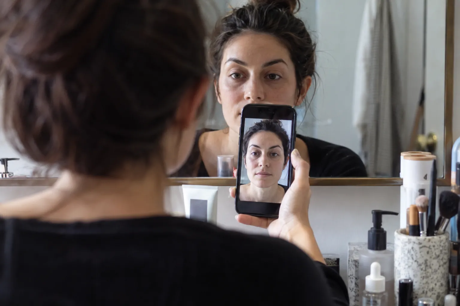
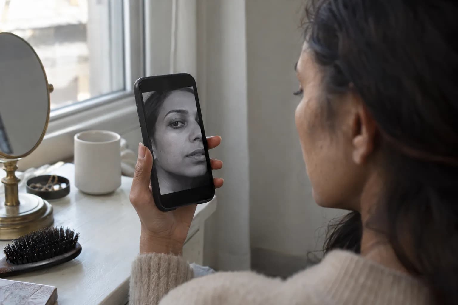
Start with your reflection, not a filtered selfie. Cameras can shift white balance and saturation, making the same face look warmer in one photo and cooler in another.
Vein, jewelry, white-versus-cream, and sun tests compared
None of these home tests can definitively identify your undertone. Think of them as clues with different weaknesses—not four equal votes in a quiz.
| Test | Traditional interpretation | How much weight to give it | Main limitation |
|---|---|---|---|
| Veins | Blue/purple suggests cool; green suggests warm; mixed suggests neutral | Low; a supporting clue only | Vein appearance depends on skin depth, lighting, and how light passes through skin |
| Jewelry | Silver suggests cool; yellow gold suggests warm; both suggests neutral | Limited; useful for exploring color preferences | Metal brightness, finish, and personal taste affect the result |
| White versus cream | Bright white suggests cool; cream suggests warm | Limited; useful when repeated carefully | Contrast and fabric brightness can matter as much as temperature |
| Sun response | Burning is often labeled cool; tanning is labeled warm | Not reliable for undertone | Burning and tanning do not map consistently to warm or cool coloring |
| Foundation swatches | A suitable shade blends into your chosen matching area | Most directly useful for choosing base makeup | Wrong depth, formula shifts, and inconsistent shade labels can mislead |
The vein test: notice, but do not diagnose
Hold your inner wrist in indirect daylight and look at several visible veins. Blue or purple-looking veins are commonly associated with cool undertones; greener-looking veins are commonly associated with warm undertones.
The problem is that you are viewing veins through skin, not reading a color chart beneath it. Green-looking veins do not prove that you are warm—or olive. A mixture of colors does not automatically make you neutral.
If your veins are faint or difficult to distinguish, skip this test. It is often less useful on deeper skin, and squinting harder will not make the result more meaningful. Treat an obvious impression as a note to check against foundation, not your final answer.
The jewelry test: compare similar pieces near your face
Choose a silver-colored piece and a yellow-gold piece of roughly equal size and shine. Hold each beside your lower cheek or wear one at a time around your neck, keeping your position and lighting unchanged.
Look for whether the metal feels connected to your overall coloring or stands apart from it. Do not simply ask which one makes your face look lighter: reflected light can brighten skin without revealing undertone.
If yellow gold consistently looks harmonious, that supports a warm lean. If silver consistently feels more balanced, that supports a cool lean. If both work, you might be neutral—but you might also suit both metals because their brightness and finish work for you.
Avoid comparing delicate brushed silver with a large polished gold necklace. You would be testing size and shine as well as color.
The white-versus-cream test: use fabric, not a screen
Hold a bright white fabric beneath your chin, then swap it for a visibly yellow-toned cream fabric. Keep both away from your face so they do not cast strong reflected color upward. Use similar textures and avoid shimmering material.
Watch the jaw and neck. Does cream feel harmonious, or does it add an unwanted yellow impression? Does white look crisp, or does it feel stark and separate from your face?
A preference for cream can support warm coloring; a preference for white can support cool coloring. But someone with soft, low-contrast coloring may find bright white overwhelming regardless of undertone. An off-white with very little yellow can also suit cool skin.
This test is better at telling you which specific fabric color you prefer near your face than assigning a permanent undertone category.
The sun test: do not use it as a deciding factor
The familiar rule that “cool skin burns and warm skin tans” is unreliable. Warm, cool, neutral, and olive skin can all have different burning and tanning responses.
If you remember how your skin has reacted to sun exposure, that history still cannot settle your undertone. Never deliberately expose your skin to test it, and keep using sun protection regardless of your result. A tan also changes the depth you need in foundation, which can confuse a comparison with your untanned skin.
What olive undertones actually look like
Olive does not mean medium-depth, tanned, or obviously green. It describes a subtle color quality that may be easiest to notice beside a foundation that is too peachy or pink.
On fair skin, olive coloring can appear pale beige with a gray-green cast. At medium depths, it may look golden-green or muted khaki-beige. On deeper skin, it can appear as a greenish-golden or muted green-brown cast. These are possible appearances, not a checklist every olive person must meet.
Clues that make olive worth investigating
- Foundations at the right depth repeatedly look salmon, pink, peach, or orange.
- Some neutral shades look pink, while warm shades add too much orange or saturated yellow.
- Your neck has a subtle greenish cast beside a peach-toned base.
- Clear pastel pinks or bright peach shades look separate from your skin, while more muted alternatives feel integrated.
No single clue proves olive coloring. A foundation that turns orange after application may simply be changing as it dries. Likewise, muted makeup can suit many non-olive people.
Olive and warm are not opposites. Warm olive skin can look golden-green; cooler olive skin can look grayer or less golden. If traditional categories never quite work, compare an olive-labeled foundation with a less saturated neutral shade at the same depth. Shade naming varies, so the swatch matters more than the label.
Confirm your result with jawline foundation swatches
For makeup shopping, this is the most practical confirmation step: you are testing the actual product against the skin it needs to match.
Use a controlled three-shade comparison
- Choose one formula and finish. Comparing a sheer luminous tint with a full-coverage matte foundation introduces too many differences.
- Pick three shades at approximately the same depth. Start with warm, cool, and neutral. Add an olive option if the earlier clues point that way.
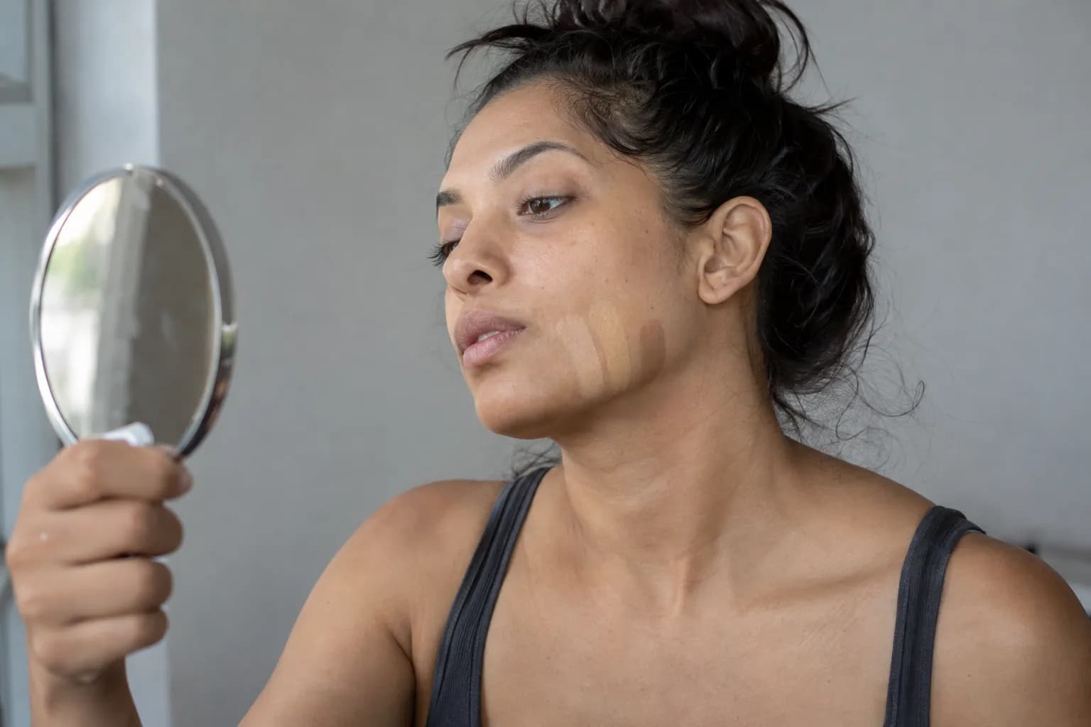
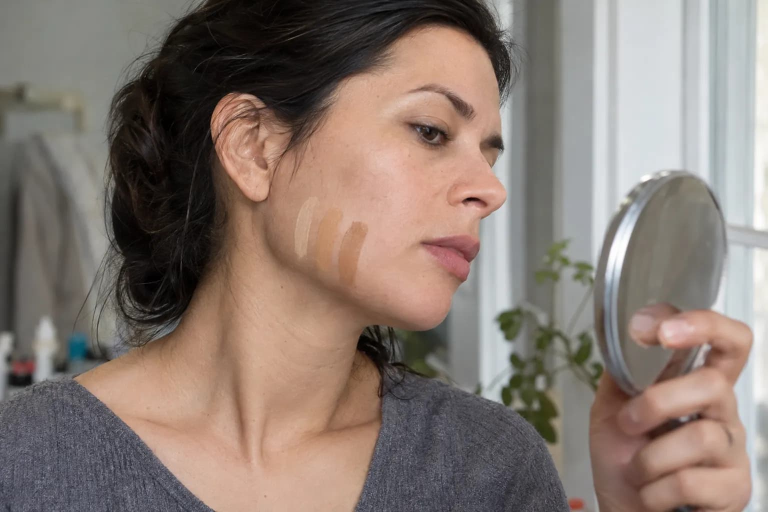
- Apply narrow stripes along the lower cheek and across the jaw. Extend each slightly onto the neck, leaving a little bare skin between stripes.
- Let them set. Follow any formula guidance, and check again after around 10–15 minutes to notice drying or color shifts.
- Inspect in indirect daylight. Look close up, then step back. The best candidate should blend into the intended matching area without leaving a distinct pink, yellow, orange, or gray stripe.
- Blend a small patch of your best candidate. A stripe helps compare shades; a blended patch shows how the base behaves at the coverage you will actually wear.
Your face, neck, and chest may naturally differ. For a seamless everyday base, aim for a balanced transition between your face and neck, considering your chest when it will be visible. Do not force a match to one unusually light or flushed patch.
Separate a depth problem from an undertone problem
If every stripe looks pale or chalky, go deeper before reassessing temperature. If every stripe looks dark, go lighter. Grayness can come from a shade that is too light or otherwise mismatched; it does not automatically mean you need warmer foundation.
If a shade starts well but becomes orange, test another formula before reclassifying your undertone. Product behavior is not a property of your skin's coloring.
Translate your undertone into makeup shade families
Undertone is a starting point, not a rule about which colors you are allowed to wear. Depth, contrast, and how bright or muted a shade is can matter just as much. If you have tan skin with a warm undertone, the warm tan skin tone guide helps you narrow down makeup and clothing colors.
| Likely direction | Blush families to try | Lip families to try | Eye shade families to try |
|---|---|---|---|
| Warm | Apricot, peach, terracotta | Brick red, cinnamon, peach-brown | Bronze, copper, warm taupe |
| Cool | Dusty rose, mauve, cool berry | Blue-red, rosewood, plum | Cool taupe, pewter, charcoal |
| Neutral | Balanced rose, soft peach-rose, muted berry | Rose-brown, balanced red, pink-brown | Neutral brown, soft taupe, muted bronze |
| Olive | Muted rose, earthy peach, terracotta, plum | Muted brick, rose-brown, wine | Khaki, olive-brown, bronze, cool taupe |
The olive row intentionally includes warm and cool options. Choose within it according to your own lean rather than assuming every olive complexion needs orange-based makeup.
For a useful comparison, apply one blush family at a time to the upper cheek, blending toward the temple. Keep the finish and amount similar: a sheer satin dusty rose and an opaque glittery peach are not a fair comparison. On deeper skin, choose enough pigment and depth for the shade to show without looking chalky. Once you’ve chosen a shade, identify your face shape to help tailor your blush placement.
For lips, start with rose-brown versus peach-brown at similar depths. Your natural lip color will influence sheer formulas, so judge the result on your lips rather than in the tube. The warm undertone guide and cool undertone guide offer directions to explore once your base swatches show a pattern.
Common mistakes when your undertone still seems unclear
Mistaking surface redness for a cool undertone
Pink cheeks do not necessarily mean your entire complexion is cool. Compare less flushed areas of the jaw and neck before choosing a pink-based foundation. If redness is persistent or concerning, ask a dermatologist rather than trying to diagnose it through undertone tests.
Treating yellow-looking skin as automatically warm
A yellow cast can appear within olive coloring, including olive skin that does not suit strongly orange makeup. If golden foundations repeatedly look peachy, test an olive or more muted neutral option instead of going warmer again.
Calling every mixed result neutral
Silver and gold both working is not enough. If a neutral foundation blends well at the correct depth, neutral is a useful working label. If all your neutral options look pink or orange, investigate olive shades and different formulas rather than accepting a poor match.
Ignoring depth and saturation
A cool lipstick can still look wrong because it is too pale, too dark, or too bright. If icy pink feels disconnected, try dusty rose before concluding that you must be warm. Similarly, a warm complexion may prefer muted brick over vivid coral.
Seasonal color analysis considers more than temperature. If your undertone seems clear but your best clothing colors do not, this guide to what color analysis is explains how depth and chroma fit into the picture.
Use Vella as a second opinion, then check in daylight
For another starting point, try the free Undertone Finder. Use an unfiltered photo in even daylight, without tinted makeup, and treat an image-based result as a suggestion to compare with your real-world swatches—not a definitive measurement.
The Vella Studio app offers 12-season color analysis from a selfie and photorealistic makeup try-on on your own photo, with a before/after slider and named shades. That lets you compare a dusty rose lip with a peach-brown lip before trying those color families in person.
Vella is available for iPhone and Android and is free to download; Vella Pro unlocks unlimited use. Use the preview to narrow your options, then let a daylight jawline match guide your foundation choice.
Frequently asked questions
How can I tell if my undertone is warm or cool?
Compare warm and cool foundation shades at the same depth along your jaw in indirect daylight. A warm shade typically has a golden, yellow, or peach direction, while a cool shade may look pink or rosy. Choose the one that blends without a visible color cast, using jewelry and fabric comparisons only as supporting clues.
Do green veins mean I have olive undertones?
No. Veins can look green because of how light passes through your skin, so vein color alone cannot distinguish warm from olive coloring. Olive is worth investigating when your skin has a subtle greenish cast and foundations at the correct depth repeatedly look too pink or orange.
Can I have olive undertones if my skin is very fair?
Yes, olive coloring can occur at any skin depth. Fair olive skin may look pale beige with a subtle gray-green or yellow-green cast rather than visibly tan. Compare an olive-labeled foundation with neutral and warm options at the same depth.
Does tanning easily mean I have a warm undertone?
No. Tanning and burning responses do not reliably identify warm, cool, neutral, or olive undertones. Do not deliberately expose your skin to sunlight as a test; use controlled color comparisons and foundation swatches instead.
Why does foundation look orange even when the depth is right?
It may be too peachy, too warm, or too saturated for your coloring. Some formulas also change color as they dry, so compare the initial application with the settled result. Try a more muted neutral or olive option if appropriate, or another formula if the color changes noticeably.
Try it on your own face
Vella Studio finds your color season and shows every look on your photo — every shade named, so you know exactly what to buy.