- Skin Tone & Undertone
- Skin Tone
- Warm Undertones
- Makeup Shades
- Color Analysis
Warm Tan Skin Tone: Undertones, Makeup and Colors
Vella Beauty Editors••11 min read
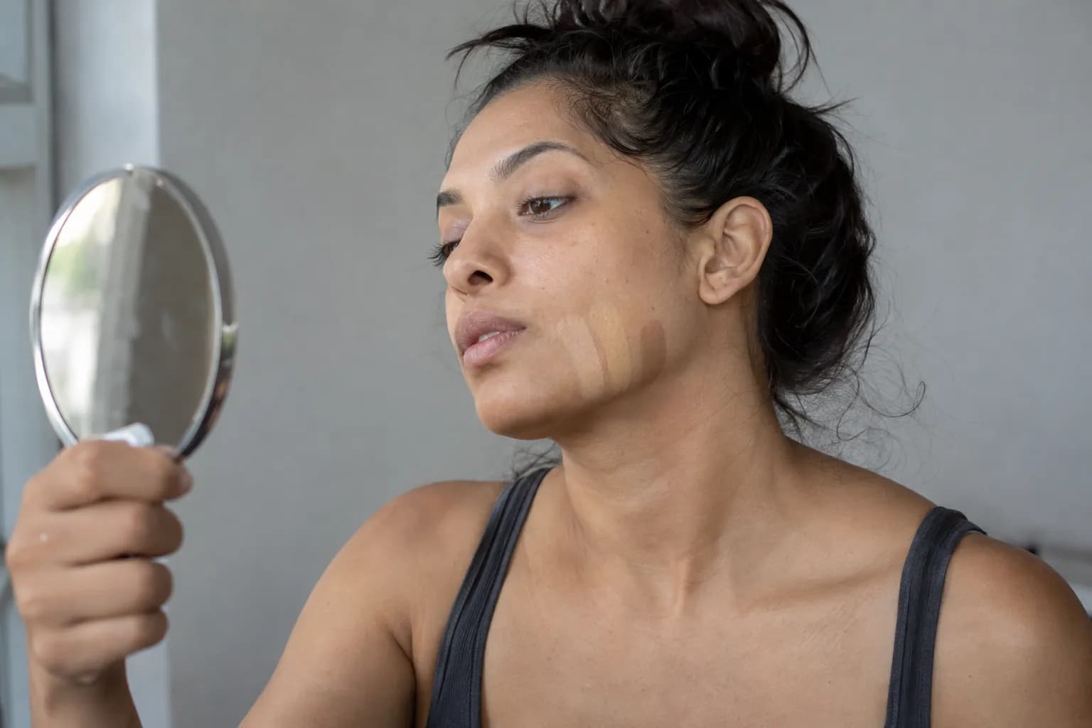
A warm tan skin tone means your skin has a tan depth and an underlying golden, yellow, or peach-leaning cast. Tan does not automatically mean warm: skin at this depth can also be neutral, cool, or olive. This guide helps you assess both dimensions, get more useful photo references, and choose foundation, blush, lipstick, eyeshadow, and clothing colors.

See your colors on your face
Vella Studio finds your color season from a selfie and tries makeup looks on your own photo.
What does warm tan skin tone mean?
Think of skin color as several characteristics working together, rather than one label that predicts every shade you should wear.
- Depth: How light or deep your skin appears. “Tan” generally describes a depth beyond medium and before deeper categories, but shade systems vary.
- Undertone: The underlying color direction you notice across your skin. Warm undertones lean golden, yellow, or peach; cool undertones lean pink, rosy, or bluish; neutral undertones look more balanced.
- Surface color: The color currently visible on top, including cheek redness, uneven pigmentation, or a recent tan.
You can have naturally tan skin without having recently tanned. Equally, a change in surface depth does not mean your underlying color direction has changed from cool to warm.
Olive needs a little extra explanation. It describes a greenish or gray-green quality that can coexist with warmth, neutrality, or coolness. Warm olive and warm golden are not always interchangeable foundation matches, even if both people describe themselves as warm tan.
Use the warm tan skin tone visual reference to put the description into context, not to match yourself pixel for pixel. Your screen, the reference image, and your viewing conditions all affect the color you see.
A foundation labeled “tan warm” is also only that brand’s description. It could be yellower, peachier, or deeper than another foundation with the same label.
How to tell whether warm tan fits you
Look for a pattern across several checks. No vein color, jewelry preference, or single photograph can reliably settle the question alone.
1. Start with useful lighting
Remove complexion makeup and let any temporary flushing settle. Stand facing a window in indirect daylight, away from direct sun, and switch off nearby lamps so you are not mixing different light sources.
Avoid strongly colored surroundings. A red wall or green top can reflect color onto your face; a neutral gray or off-white background is easier to judge against.
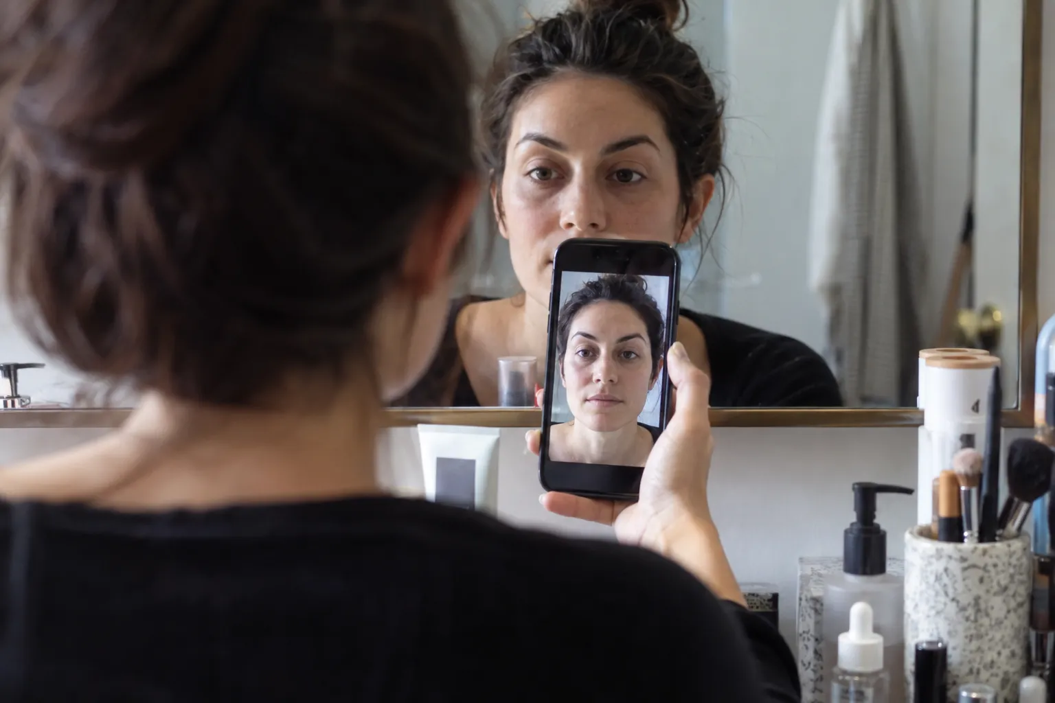
For a photo, turn off beauty filters and avoid portrait effects that visibly change skin color. Include your jaw, neck, and some upper chest. The front camera’s automatic white balance can still shift your coloring, so take photos on more than one occasion and compare them with what you see in a mirror.
Warm indoor bulbs may make neutral skin look golden. Cool light may make warm skin look gray, while direct sunshine can create yellow highlights and deep shadows. A photo is evidence, not a verdict.
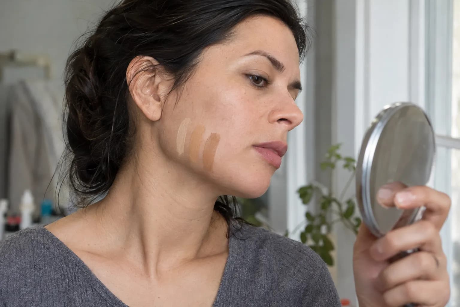
2. Compare similar-depth foundation swatches
Choose three nearby shades: golden or yellow-warm, neutral, and olive if available. Keep their depth as similar as possible; a lighter shade can look ashy simply because it is too light.
Apply narrow stripes across the jaw toward the neck. Let them set according to the formula’s instructions, then inspect them in indirect daylight. The best match should become less noticeable rather than create a yellow, orange, pink, or gray stripe.
| Possible undertone | Clues across repeated comparisons | Foundation families to investigate |
|---|---|---|
| Warm golden | Golden shades blend in; comparable neutral shades may look pink or flat | Golden, yellow-warm, warm beige |
| Neutral | Strong yellow and pink shades both stand apart from your skin | Neutral tan, balanced beige, neutral-warm |
| Warm olive | A muted green-gold quality is visible; peachy bases often look orange | Golden olive, warm olive, muted yellow-olive |
| Neutral olive | Skin looks muted or green-gray rather than distinctly peach or gold | Neutral olive, muted olive |
These are starting points, not universal rules. Shade names are inconsistent, so judge the actual swatch.
3. Add a fabric comparison
Hold cream and cool white, then rust and blue-based berry, beneath your chin. Keep fabric size, lighting, and makeup consistent. Look for whether the color makes your complexion appear more even or seems to emphasize shadows and unevenness.
If warmer colors repeatedly feel harmonious and golden foundation disappears into your skin, the warm description becomes more useful. If the clues disagree, compare neutral-warm and olive options rather than forcing a label. The warm undertone guide offers another reference point.
Choose foundation by depth first, undertone second
For warm tan skin, useful starting families include golden tan, yellow-warm tan, warm beige, and neutral-golden tan. Peach-warm may work if your warmth looks peachy rather than distinctly yellow, but it can turn visibly orange on golden or olive skin.
Do not buy a deeper foundation to create warmth. Depth and undertone are separate adjustments; a foundation that is both too dark and too orange is harder to correct with the rest of your makeup.
A practical matching routine
- Identify your depth range. Compare several adjacent shades without focusing on their names.
- Choose two or three undertone options within that range. Start with golden and neutral-warm; add olive if warm shades regularly look orange.
- Swatch from the lower cheek across the jaw. Do not rely on your wrist or the back of your hand, which may differ from your face.
- Allow the formula to settle. Check whether the color changes as it dries rather than assuming the wet shade is the final result.
- Check your face, neck, and exposed chest together. Look for a believable transition, especially if your face is lighter or redder than surrounding skin.
- Inspect a thin, blended application. A thick stripe helps compare color, but your normal coverage tells you whether the match works in practice.
For spot concealing, stay close to your foundation depth and undertone. Under the eyes, a slightly lighter concealer can brighten, but a very pale shade may look chalky against tan skin.
Keep bronzer separate from foundation matching. Apply a sheer golden-brown or warm neutral-brown bronzer around the temples and upper outer cheeks where you want warmth. If you want a shadow effect for contour, choose a muted neutral brown rather than an orange bronzer.
Blush and lipstick shades that complement warm tan skin
The most useful color is not always the warmest one available. Depth, pigment strength, and the amount of white in a shade can matter just as much as undertone.
Blush: start with peach-brown, terracotta, and warm rose
Try these families according to the effect you want:
- Peach-brown or apricot: Soft, everyday warmth without an obvious red cheek.
- Terracotta or cinnamon rose: Earthy color with enough depth to show up on tan skin.
- Burnt coral: A brighter, warmer flush.
- Warm rose or rose-brown: A pinker option that does not depend on orange tones.
- Brick: A stronger flush that works best built in thin layers.
Place blush on the upper outer cheek and blend toward the temple for a lifted direction. For a softer, rounded effect, start on the apples and blend outward, keeping the edges diffused. Check your placement with your face relaxed, not only while smiling.
If pastel peach looks dusty, try a richer peach-brown before deciding peach is wrong for you. A sheer satin or cream finish can make the color easier to build without a powdery-looking edge.
Lipstick: match the depth of your lips as well as your skin
For a nude, begin near your natural lip depth with caramel rose, cinnamon beige, peach-brown, or warm rose-brown. A pale beige may look disconnected even when its undertone is technically warm.
For stronger color, consider brick red, tomato red, burnt coral, terracotta, or warm reddish brown. A brown-rose liner close to your lip color can soften the transition into a lighter lipstick; blend it inward rather than leaving a hard ring.
Dusty rose can work too, particularly when it has some brown rather than a strongly lavender-gray base. If it looks dull alone, try a warmer liner or a sheer application. See the lipstick guide for warm undertones for more shade-family comparisons.
You do not need to rule out cool reds or berry lips. They create contrast rather than the blended harmony of brick and terracotta.
Eyeshadow colors and an easy placement plan
Bronze, copper, warm taupe, caramel, chestnut, and chocolate brown are reliable starting points for warm tan skin. Antique gold, olive, and deep plum offer variety without requiring a completely different routine.
Warm taupe is especially useful if copper looks too orange. Look for a brown-based taupe rather than a silver-gray one, and choose enough depth that it does not disappear against your skin.
For a simple three-shade eye:
- Add soft definition. Blend matte caramel or warm taupe slightly above the natural crease, checking the placement with your eyes open.
- Place light on the lid. Press bronze or antique gold onto the mobile lid. Keep shimmer concentrated there rather than spreading it through every transition.
- Deepen the outer corner. Tap chestnut or chocolate onto the outer third and blend inward with a small brush.
- Define the lashes. Use espresso or deep bronze liner close to the upper lash roots. Smudge the outer edge for a softer finish.
If your crease is hidden when your eyes are open, keep the transition color visible just above the fold and use a narrower shimmer placement.
For a brighter look, try copper with warm brown liner. For a quieter look, pair matte warm taupe with espresso. For contrast, use muted plum or olive along the lash line while keeping the lid simple.
A champagne-gold or soft bronze highlight often blends more easily than an icy white shimmer. Check it straight on as well as from the side: a pale stripe visible when it is not catching light may be too light or too heavily applied.
Clothing colors: build around warmth, then adjust contrast
Warm tan skin can look harmonious with cream, camel, cognac, warm chocolate, rust, terracotta, coral, tomato red, mustard, and olive. These are useful starting points, not a dress code.
The best version of each color depends on how bright or muted your overall coloring is and how much contrast exists between your skin, hair, and eyes.
| Color role | Shades to try | How to adjust |
|---|---|---|
| Light neutral | Cream, oatmeal, warm ivory | Choose a clearer cream if oatmeal looks dull |
| Everyday neutral | Camel, cognac, warm chocolate | Go lighter or deeper if camel blends into your skin too closely |
| Warm accent | Rust, burnt coral, tomato red | Compare muted rust with clearer coral to judge intensity |
| Green | Olive, moss, warm forest | Try deeper forest if yellow-green overwhelms your face |
| Contrasting accent | Teal, petrol blue, aubergine | Use these when you want contrast rather than an entirely warm palette |
Test colors close to your face, where their effect is easiest to see. The same camel that works beautifully as trousers may feel too similar to your skin in a high-neck sweater; a cream collar or chocolate layer can create separation.
Black, cool white, and silver are not forbidden. They may look more contrasting, which can be exactly the effect you want. Gold or bronze jewelry can echo warm coloring, but metal preference does not prove undertone.
Warm tan also does not automatically mean Autumn in seasonal color analysis. A season considers more than skin warmth, including overall depth, clarity, and contrast.
Common mistakes and what they actually tell you
When a shade looks wrong, troubleshoot the specific mismatch before changing your entire undertone label.
- Every warm foundation looks orange. The options may be too peachy, too saturated, or too deep. Compare yellow-golden, neutral-warm, and olive at a similar depth.
- Foundation looks gray or ashy. It may be too light or too muted, not necessarily too cool. Check depth before reaching for a yellower shade.
- The match works in the bathroom but fails outside. Mixed or warm lighting may have hidden the mismatch. Repeat the check in indirect daylight.
- You matched the redness in your cheeks. Compare the jaw, neck, and chest rather than choosing a pinker base to match one area.
- Gold jewelry looks good, so you assumed warm. Finish, outfit, and personal taste affect the result. Use jewelry as a supporting clue alongside swatches and fabric comparisons.
- Warm makeup makes the whole face look orange. You may have combined peach foundation, orange bronzer, copper shadow, and coral blush. Keep the base accurately matched and balance stronger warmth with rose-brown, warm taupe, or neutral chocolate.
- Your selfie looks different every time. Camera processing, reflected color, and exposure may be shifting the image. Compare consistent photos with a mirror assessment rather than averaging filtered selfies.
The goal is not to find a label that explains every preference. It is to identify repeatable choices that make matching easier.
Use Vella as a second opinion
Try the free Undertone Finder for an initial check, using a photo taken in indirect daylight without complexion makeup or color-changing filters. Treat the result as another clue alongside your foundation swatches and fabric comparisons.
The Vella Studio app offers 12-season color analysis from a selfie and photorealistic makeup try-on on your own photo, with named shades and a before/after slider. You can compare ideas such as terracotta versus warm rose blush or brick versus coral lipstick before testing similar shade families in person.
A virtual preview helps you explore color relationships; it cannot confirm a foundation’s real-life match, texture, or dry-down. For that, return to the jawline swatch in useful lighting.
Frequently asked questions
What does warm tan skin tone mean?
Warm tan describes two separate characteristics: tan skin depth and a warm, golden, yellow, or peach-leaning undertone. Tan skin is not automatically warm, and the description does not mean you have recently tanned.
How can I tell whether my tan skin is warm or neutral?
Compare golden and neutral foundation shades at a similar depth across your jaw in indirect daylight. Add fabric comparisons on more than one occasion and look for a consistent pattern. Vein color and jewelry preference are supporting clues, not reliable standalone tests.
Can warm tan skin also have olive undertones?
Yes. Olive describes a greenish or gray-green quality that can coexist with warmth, so you can have warm tan olive skin. If peach-warm foundations consistently look orange, compare golden-olive and neutral-olive shades at the same depth.
What foundation undertone is best for warm tan skin?
Golden, yellow-warm, warm beige, and neutral-golden are useful starting families. If your skin is olive, an olive-specific option may blend better than a peach-warm shade. Always judge the actual swatch because shade labels vary between brands.
What colors look good on warm tan skin?
Try terracotta or warm rose blush, brick red or caramel-rose lipstick, and bronze or warm taupe eyeshadow. For clothing, cream, cognac, chocolate, rust, coral, olive, and teal offer useful starting points. Adjust each color’s depth and brightness to suit your overall contrast and preferences.
Why does my skin look warm in photos but neutral in person?
Warm bulbs, reflected color, filters, and automatic camera white balance can make skin look more golden than it is. Photograph yourself facing indirect daylight with nearby lamps switched off and compare the image with a mirror assessment. A single photo should not determine your undertone.
Try it on your own face
Vella Studio finds your color season and shows every look on your photo — every shade named, so you know exactly what to buy.