- Color Analysis
- Color Analysis
- Soft Autumn
- Makeup Shades
- Personal Style
Soft Autumn Color Palette: Your Best Shades and Makeup
Vella Beauty Editors••11 min read
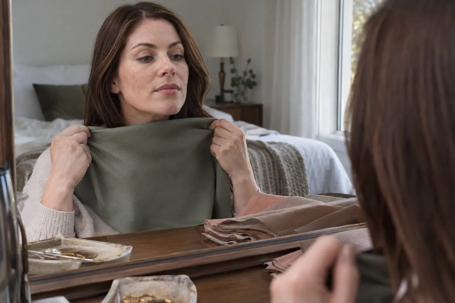
The soft autumn color palette is muted and gently warm, built around shades such as sage, warm taupe, dusty peach, olive, and rose-brown. If these colors let your features stand out without looking overpowering, Soft Autumn may be worth exploring. This guide covers your most useful clothing colors, makeup placement, hair shades, and metals, plus a practical comparison with Soft Summer.

See your colors on your face
Vella Studio finds your color season from a selfie and tries makeup looks on your own photo.
What defines the Soft Autumn color palette?
In the 12-season framework, Soft Autumn sits between True Autumn and Soft Summer. Its defining quality is softness first, warmth second: colors look slightly weathered, smoky, or mixed with gray-brown rather than bright and clear.
Three qualities help explain the palette:
- Chroma: muted. Dusty apricot works better as a reference than vivid tangerine; gray-green is more representative than emerald.
- Temperature: neutral-warm. There is a gentle golden, peachy, or earthy direction, but not every shade needs an obvious yellow cast.
- Value: generally medium, with useful light and deep options. Oatmeal and cream provide highlights; soft espresso and deep olive provide definition.
Soft Autumn styling usually favors blended color relationships rather than sharp light-dark jumps. That does not mean you must have pale skin, light eyes, or light brown hair. A season is a proposed relationship between your coloring and surrounding colors, not a checklist of demographic traits. If deeper colors suit you better than muted midtones, compare Deep Winter vs Deep Autumn to explore whether cool or warm depth feels more harmonious.
Likewise, brown eyes or freckles cannot confirm this season. Natural hair color can offer context, but dyed hair, makeup, and lighting can distort the impression. The useful question is whether muted, gently warm colors consistently look more harmonious beside your uncovered face.
Treat seasonal analysis as a styling framework, not a scientific diagnosis. The Soft Autumn color palette reference gives you a starting vocabulary; side-by-side comparisons help you decide whether that vocabulary works for you.
Your best colors—and the shades to approach carefully
Start with neutrals because they occupy the most space in everyday outfits. Warm taupe, mushroom, oatmeal, soft camel, and cocoa create an easier foundation than pure white and jet black.
Color names are imperfect, so inspect the actual shade. One retailer’s “camel” may be softly beige; another’s may be strongly orange. Look for a muted quality and moderate warmth rather than trusting the label.
| Color role | Strong Soft Autumn starting points | Often harder near your face | Easy substitution |
|---|---|---|---|
| Light neutral | Oatmeal, ecru, muted cream | Optical white, icy silver-white | Choose softened ivory rather than bright white |
| Midtone neutral | Warm taupe, mushroom, camel-beige | Very blue-gray, orange camel | Choose gray-brown or muted tan |
| Deep neutral | Cocoa, soft espresso, deep olive | Jet black, stark blue-black | Use softened brown for similar depth |
| Pink and red | Warm dusty rose, rose-brown, muted brick red | Fuchsia, cherry red, icy pink | Choose a browned or softly peachy version |
| Orange and yellow | Dusty apricot, soft terracotta, muted ochre | Neon coral, clear orange, lemon yellow | Reduce brightness before adding warmth |
| Green | Sage, moss, olive, eucalyptus | Electric lime, jewel emerald | Look for gray-green or brown-green |
| Blue | Muted petrol, softened teal, green-leaning slate | Cobalt, icy blue, electric turquoise | Choose smoky blue-green |
| Purple | Muted aubergine, browned plum | Clear violet, icy lilac | Use an earthy plum in a small dose |
What “worst colors” really means
The most challenging shades tend to be very bright, very icy, or very stark. They may become the focal point before your face does, or make your makeup seem faint by comparison. Strongly orange colors can be difficult too: Soft Autumn is not a prescription to wear every warm shade.
None of these colors is forbidden. Keep a favorite cobalt on trousers, wear a black skirt with a mushroom knit, or soften a white shirt with a sage scarf around the neckline. Placement matters most where color directly borders your face.
For prints, try olive with oatmeal, dusty peach with cocoa, or warm taupe with muted teal. The pattern can be bold in size while remaining gentle in color contrast.
Soft Autumn makeup: lips, blush, and eyes
Your most useful makeup shades echo the palette without making every feature brown. Aim for soft edges, controlled saturation, and enough depth to remain visible on your skin. A pale beige shade is not automatically flattering just because it looks muted in the pan.
Lips: rose-brown, peach-brown, and softened brick
Start with warm rose, rosewood, peach-brown, muted terracotta, or a browned brick red. For an everyday lip, choose a shade close to your natural lip depth with slightly more warmth or definition. For more shade guidance by skin depth, see our guide to the best lipstick for warm undertones.
On lighter skin, a medium rose-beige may give sufficient contrast. On deeper skin, try richer rose-brown, chestnut rose, or a deeper muted brick rather than a light beige that may look chalky. Your natural lip pigment will also change the result.
Apply in three steps:
- Trace the lip edge lightly with a rose-brown or neutral-brown pencil close to the lipstick’s depth.
- Add lipstick through the center, then press your lips together to distribute it.
- Tap the outline with a fingertip or clean brush to remove a hard border.
Satin, softly blotted matte, and sheer balm finishes are useful starting points. Gloss can work too; choose a warm translucent tint rather than an opaque icy pink.
Blush: dusty peach, warm rose, and rose-bronze
Look for peach-beige, muted apricot, warm dusty rose, or rose-bronze. For deeper complexions, richer terracotta-rose or subdued copper-rose can supply the same muted warmth without disappearing.
Place a small amount on the outer apple of your cheek and blend upward toward the temple. Keep the strongest color on the cheek rather than spreading it across the entire side of your face. Check straight on and from the side before adding another layer.
If peach turns visibly orange, test a more neutral rose-brown instead. If a blush looks gray or leaves a pale cast, it may be too light or have too much white in its base—not necessarily the wrong seasonal family.
Eyes: warm taupe, olive, cocoa, and muted bronze
Build a simple eye with these placements:
- Sweep matte warm taupe through the crease or just above the fold where it remains visible with your eyes open.
- Press muted bronze, mushroom, or olive onto the mobile lid.
- Blend cocoa into the outer third for depth, keeping the edge diffused.
- Work espresso or deep olive liner close to the upper lashes; soften it with a small brush.
- Add mascara in brown, brown-black, or black according to the definition you want.
Soft Autumn does not require brown mascara if it makes your lashes disappear. A thin black lash line can be a smaller, more manageable dose of contrast than a wide black wing.
For shimmer, try subdued champagne, antique gold, or bronze. A fine sheen often integrates more easily than a large, icy sparkle, but finish remains a style choice rather than a seasonal rule.
Base makeup should match your skin, not your season
Do not buy a yellow foundation because you suspect you are an Autumn. Match foundation to your actual skin and neck in daylight. The guide to finding your undertone can help separate your skin’s undertone from surface redness, tanning, and seasonal palette labels.
If you use bronzer, apply a small amount of muted tan or neutral-warm brown around the temples and upper outer cheeks. For contour beneath the cheekbone, choose a believable shadow tone rather than using orange bronzer to imitate depth.
Hair colors and metals that support gentle warmth
Hair frames your face continuously, so a dramatic change can alter the contrast of your entire look. Begin with your natural depth and the colors you already enjoy wearing, not a rule that every Soft Autumn should become blonde.
Hair color families to explore
Useful starting points include beige blonde, dark honey blonde, mushroom brown with subtle warmth, soft chestnut, and muted caramel brunette. If you prefer red, consider subdued copper-brown or soft auburn rather than bright orange copper or vivid burgundy.
For highlights, ask for fine, blended pieces that stay reasonably close to the base. Beige-caramel ribbons through brown hair usually create a softer transition than pale, chunky streaks. Keeping some depth around the roots can also prevent lighter lengths from making the overall look feel disconnected.
Potentially difficult directions include icy platinum, blue-black, highly silvered ash, and intensely golden or orange tones. But you do not need to recolor naturally dark hair to fit a seasonal label. Adjusting the makeup and clothing beside it may be enough.
Because salon shade names vary, bring visual references and describe both what you want—muted warmth—and what you want to avoid, such as strong brassiness or a flat gray result.
Metals: subdued shine before strict rules
Try brushed gold, antique gold, soft bronze, copper, and muted rose gold. Their warmth often works well with earthy clothing and makeup.
Silver is not automatically wrong. A brushed or antiqued silver can be easier to wear than highly reflective chrome, especially if your coloring is close to neutral. Compare similarly sized earrings with your hair pulled back: otherwise, differences in scale and shine can masquerade as a temperature preference.
For mixed metals, repeat one finish elsewhere in the outfit so the combination feels intentional.
How to tell Soft Autumn from Soft Summer
Both seasons prioritize muted color. The main difference is temperature: Soft Autumn leans warm; Soft Summer leans cool. If both seem plausible, compare colors with similar depth and softness so warmth is the main variable.
| Test area | Soft Autumn direction | Soft Summer direction |
|---|---|---|
| Neutral near the face | Warm taupe or mushroom-brown | Cool taupe or gray-beige |
| Pink | Peachy dusty rose | Mauve dusty rose |
| Green | Muted olive or yellow-leaning sage | Blue-leaning sage or soft sea green |
| Blue | Smoky petrol or muted teal | Dusty denim or slate blue |
| Lip color | Rose-brown or peach-brown | Muted mauve or cool rose |
| Overall impression | Earthy, gently golden | Smoky, gently rosy or blue-gray |
A more useful at-home draping test
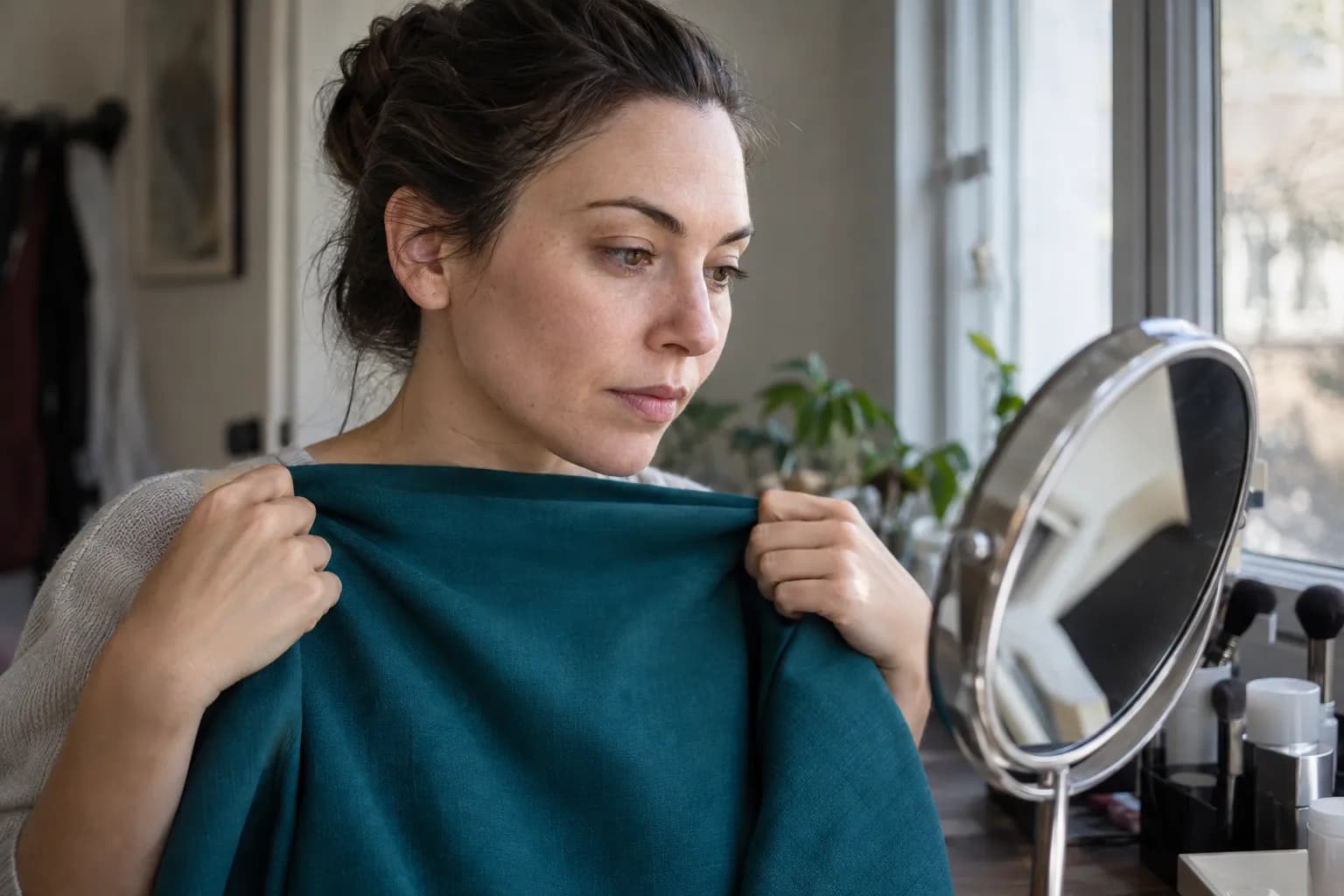
- Use indirect daylight. Face a window and turn off strongly yellow indoor lighting. Avoid direct sun and colored light reflected from a nearby wall.
- Remove color distractions. Take off makeup and cover dyed hair with a neutral fabric if you can.
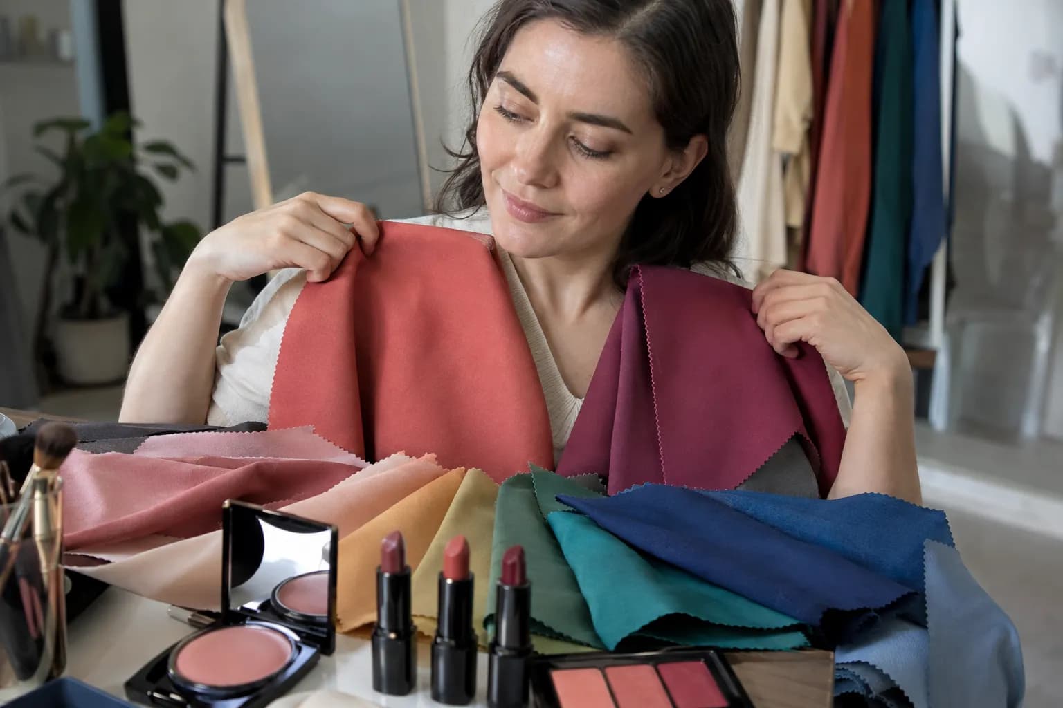
- Choose three matched pairs. Try warm versus cool taupe, peachy versus mauve rose, and olive versus blue-green sage. Keep each pair close in depth and saturation.
- Hold each fabric beneath your chin. Look at your face first, then the fabric. Notice whether your features remain defined and whether the color appears connected to your face or separate from it.
- Repeat before deciding. Look for a consistent preference across several pairs, not a verdict based on one flattering shirt.
If the warm versions repeatedly seem orange or yellow beside you while the cool versions look balanced, explore the Soft Summer color palette. If mauve and blue-gray seem noticeably gray against you but peach-rose and olive feel integrated, Soft Autumn is a stronger possibility.
Neither response should be judged from redness alone. Temporary skin changes, camera white balance, and fabric brightness can all mislead you. If you photograph the test, keep exposure and white balance consistent where possible; your camera may otherwise adjust each image differently.
If both soft palettes feel dull but clearer colors look lively, reconsider whether softness is your dominant quality at all.
Common mistakes—and a practical starter wardrobe
Confusing muted with pale
Soft colors can be deep. Cocoa, muted aubergine, and dark olive still belong in a softened wardrobe. If your outfit looks washed out, add depth at the neckline, brows, lashes, or lips before abandoning the palette.
Confusing warm with orange
Head-to-toe rust, mustard, and copper may supply more warmth than you want. Start with mushroom, sage, and warm rose, then add stronger earth tones in smaller amounts.
Treating low contrast as an absolute rule
Your preferred contrast level deserves its own check. The Contrast Analyzer can offer another reference, but compare that result with what you see in actual outfits. Some faces need a deeper collar, clearer lash definition, or a stronger lip even within a muted palette.
Replacing everything at once
Build three outfits from what you already own:
- Everyday: warm taupe top, olive trousers, cocoa shoes, and subdued gold earrings.
- Work: oatmeal shirt, mushroom jacket, soft espresso trousers, and rose-brown lipstick.
- Evening: muted teal top, deep brown bottoms, bronze eyeshadow, and a blotted brick lip.
Prioritize tops, scarves, earrings, and lip colors because they sit closest to your face. Photograph combinations in consistent light and keep the ones you genuinely enjoy—not just the ones that obey a chart.
Check your palette with Vella
For another starting point, try Free AI Color Analysis, then compare the suggested season with your daylight draping results. A selfie-based result is a useful reference, not a reason to ignore lighting differences or your own preferences.
The Vella Studio app provides 12-season analysis from a selfie and photorealistic makeup try-on on your own photo with a before/after slider. Use it to preview a rose-brown lip or muted bronze eye before choosing similar shades in person. The app is free to download on iPhone and Android; Vella Pro unlocks unlimited use. Preview colors digitally, then confirm the actual shade and finish on your skin.
Frequently asked questions
What colors look best on Soft Autumn?
Soft Autumn generally suits muted, neutral-warm shades such as sage, olive, warm taupe, mushroom, dusty peach, rose-brown, and softened teal. Oatmeal and cocoa are useful alternatives to stark white and black. Choose enough depth for your individual coloring rather than assuming every shade should be pale.
How do I know if I am Soft Autumn or Soft Summer?
Compare equally muted colors that differ mainly in temperature, such as peachy dusty rose versus mauve rose or warm taupe versus cool taupe. Soft Autumn leans warm, while Soft Summer leans cool. Test several pairs without makeup in indirect daylight, looking for a consistent preference rather than relying on hair or eye color.
Can Soft Autumn wear black?
Yes, although a large area of black directly beneath the face may create more contrast than you want. Try a warm taupe neckline, sage scarf, or rose-brown lip to soften the effect. Cocoa and soft espresso offer similar depth with a less stark result.
What lipstick shades suit Soft Autumn?
Start with warm rose, rosewood, peach-brown, muted terracotta, and softened brick red. Match the depth to your lips and complexion: richer rose-brown may work better than pale beige on deeper skin. A blotted edge or satin finish is an easy way to keep the color softly defined.
Can Soft Autumn have dark hair or dark skin?
Yes. Skin depth and hair color alone do not determine a season; the framework considers how surrounding colors relate to your overall coloring. If you have deeper coloring, you may prefer the palette’s cocoa, deep olive, and richer rose-brown shades over its palest options.
Should Soft Autumn wear gold or silver jewelry?
Subdued gold, antique gold, bronze, and muted rose gold are useful starting points. Brushed or antiqued silver can also work, particularly if your coloring is close to neutral. Compare pieces with similar size and shine so you are testing metal color rather than reflectivity.
Try it on your own face
Vella Studio finds your color season and shows every look on your photo — every shade named, so you know exactly what to buy.